
acf domain was triggered too early. This is usually an indicator for some code in the plugin or theme running too early. Translations should be loaded at the init action or later. Please see Debugging in WordPress for more information. (This message was added in version 6.7.0.) in /home1/labis658/public_html/wp-includes/functions.php on line 6170


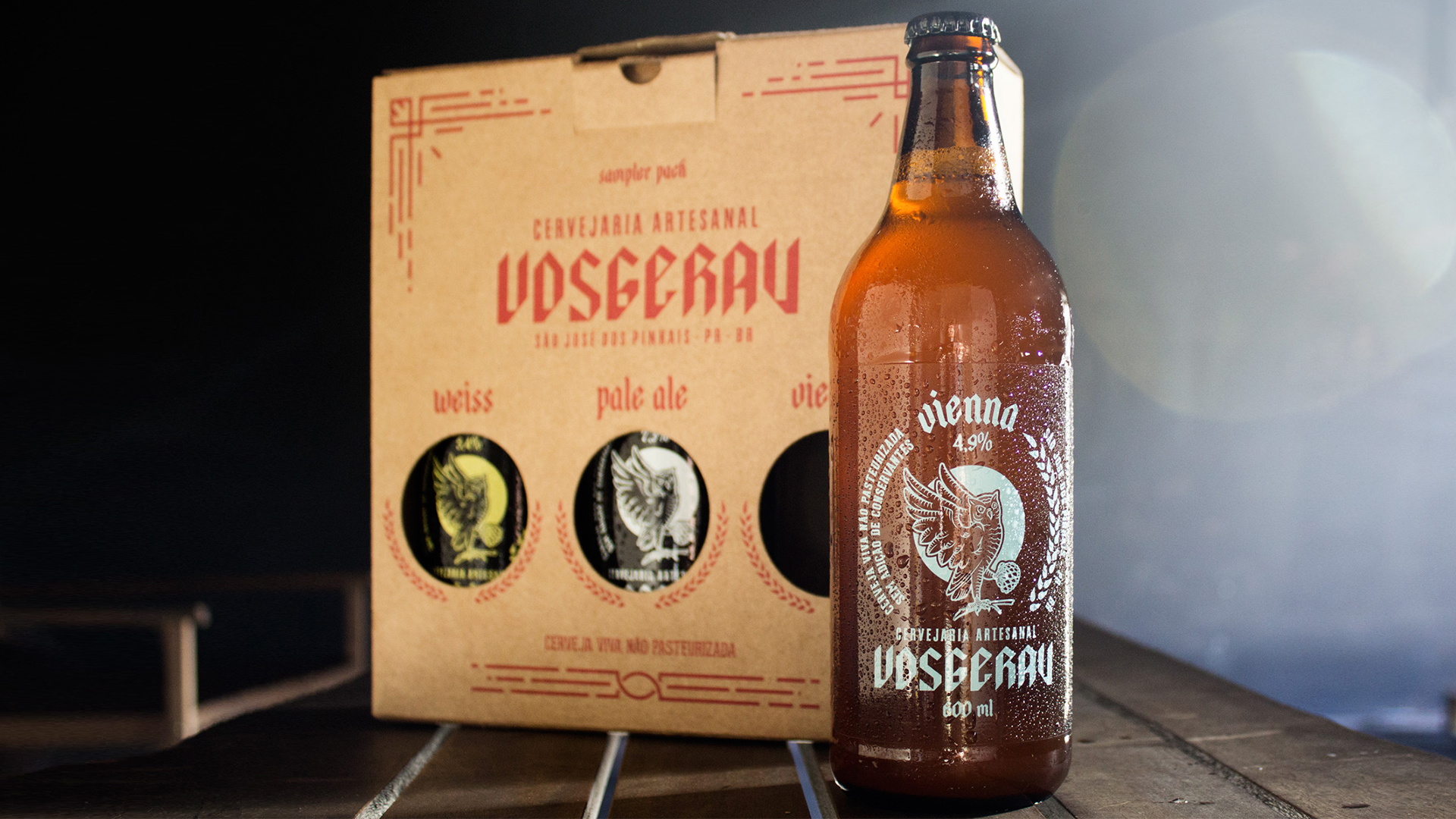
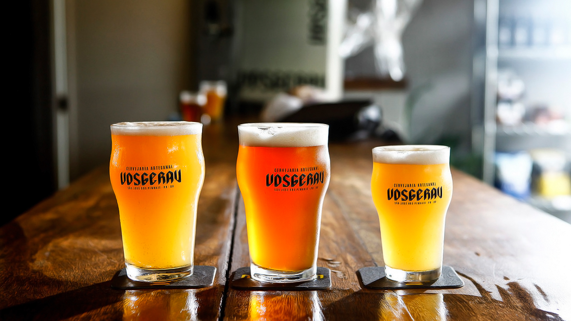
Founded in São José dos Pinhais-PR, Vosgerau is a nano brewery company that uses a craft process for the production of its beers. Its production capacity is very small: about 500 bottles / month, divided among the three types it produces: Pale Ale, Vienna and Weiss. The goal is to become a microbrewery and increase production to 3,000 bottles / month, with a focus on the Curitiba-PR market.
Labis Design redesigned the brand and the label of three beers through the Brand Language Design method, which gave us the basis to develop, apply and harmonize symbol, serigraphy, typography in the most appropriate way.
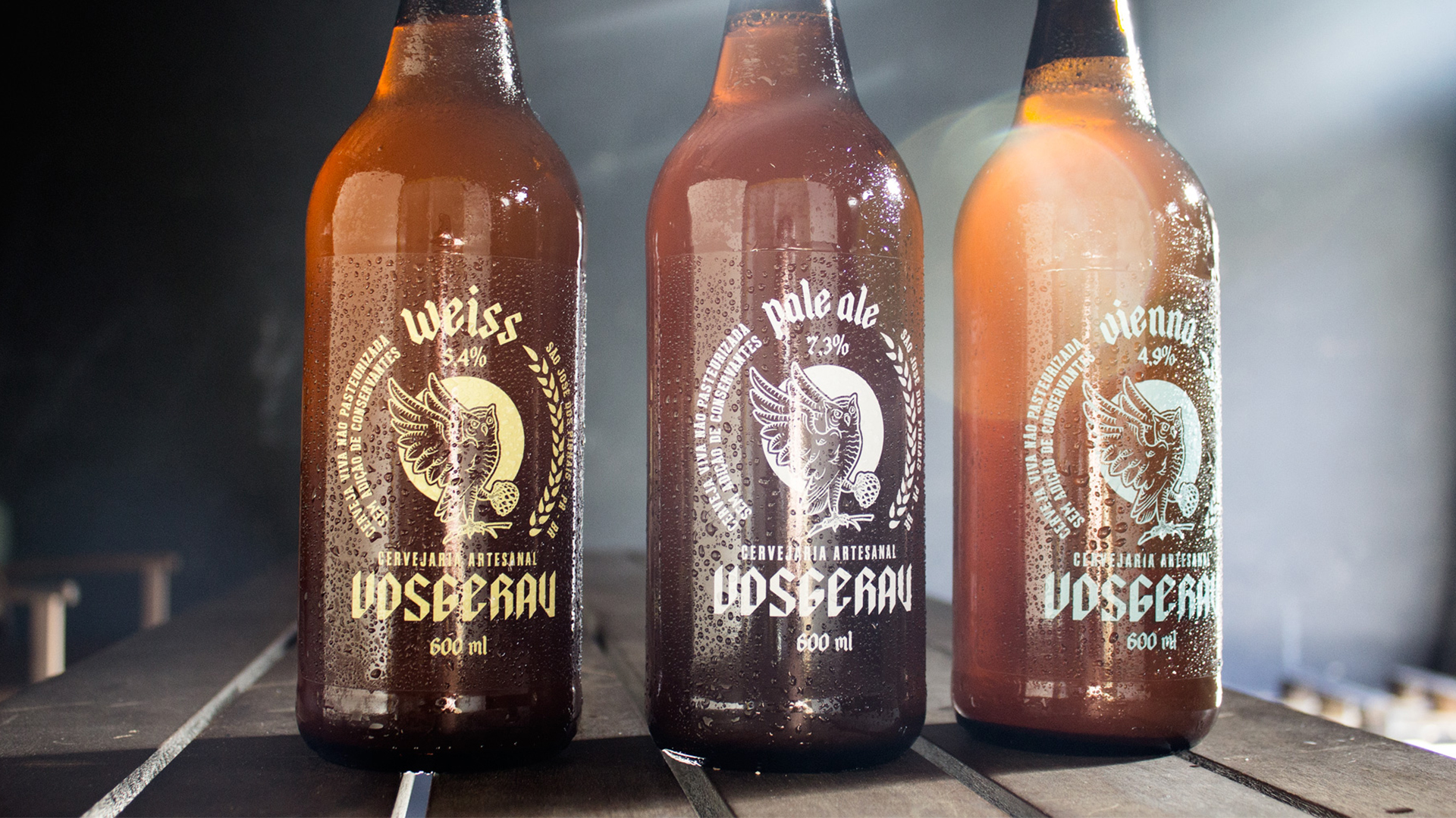
The objective of the work is to build a strong brand for the Vosgerau brewery, exploring the motto “The beer of São José dos Pinhais”. We developed a visual identity for the brand that was later declined on the labels of the three types of beer, so the customer has the facility to split into possible other brews without worrying about the definition of a new line identity.
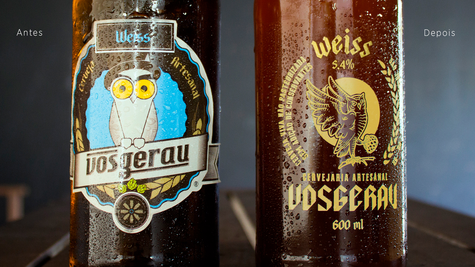
The main point for this choice is that it allows the brand to be fixed on the final consumer, since Vosgerau is expanding distribution and is a new brand in the market, it is interesting that it supports the visibility of the labels for Grow, keeping the mascot of the old version: the owl.
São José dos Pinhais, even though it is the second largest city in Greater Curitiba, even though its residents – on a large scale – work and participate much in the life of the capital, although their symbols and traditions are very similar to those of Curitiba, is a living city with its own lifestyle and traditions.
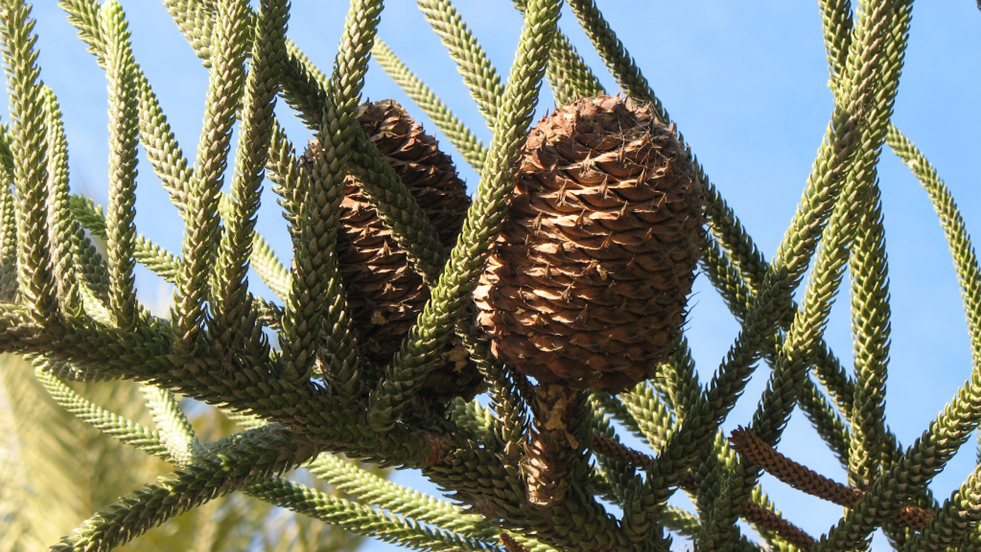
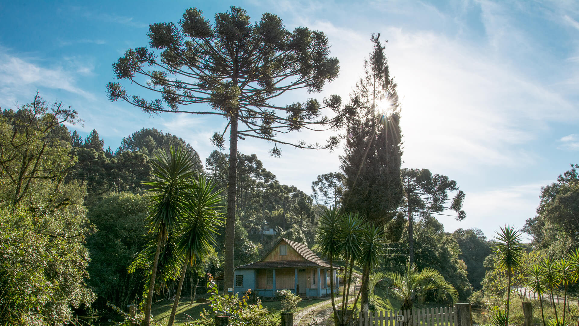
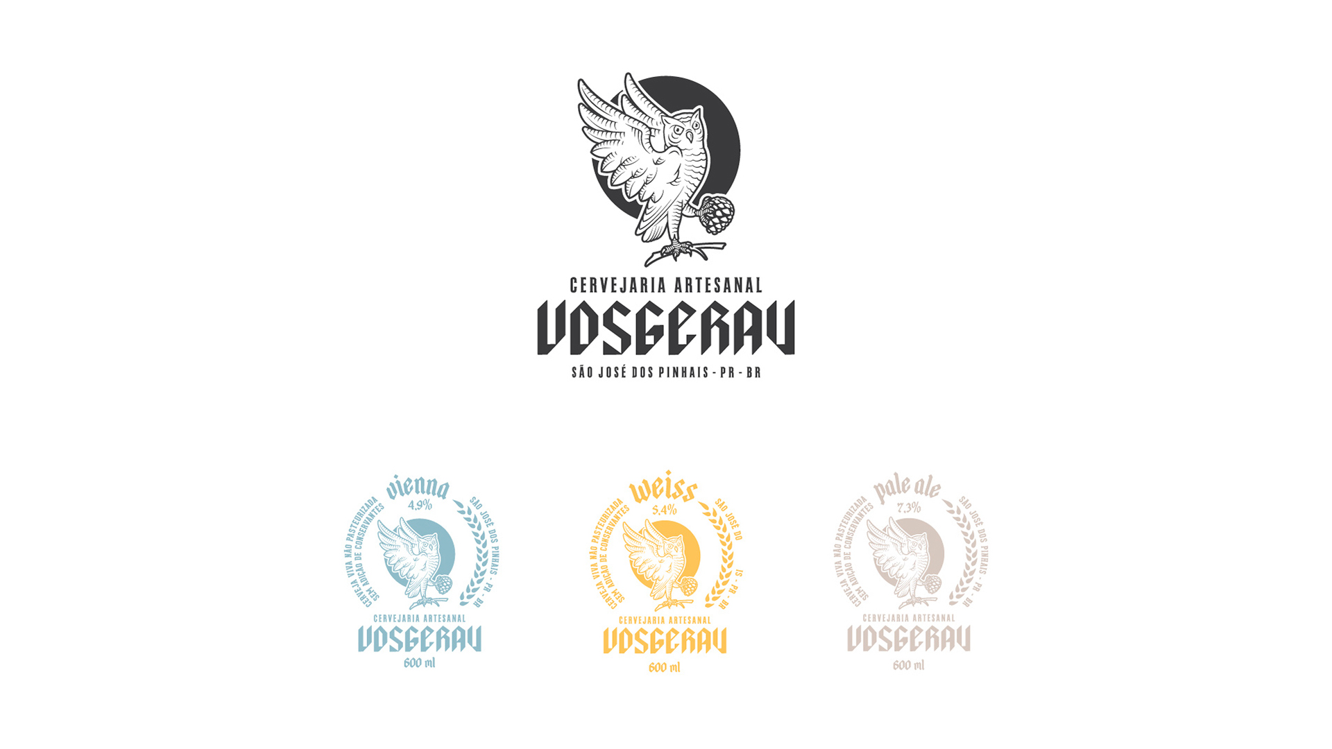
Labis Design made a general overview of the symbols and traditions, so that we can imprint on the Vosgerau brand redesign the tradition of its home city. The symbol that we chose to represent the city was the Araucarias pine cone.
The symbol chosen for the Vosgerau brand was the owl. Owl is the sovereign bird of the night. For many people the owl means mystery, intelligence, wisdom and knowledge. She has the ability to see through the darkness, being able to see what others do not see. The owl symbolizes reflection, rational and intuitive knowledge. In Greek mythology, Athena, the goddess of wisdom, had the owl as a symbol.
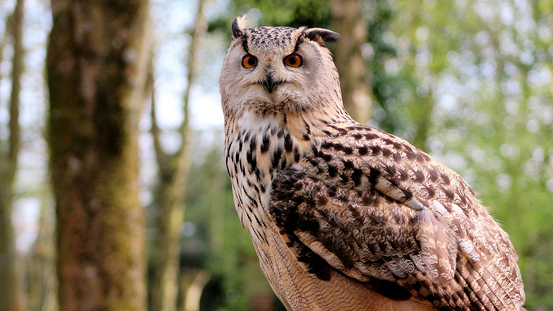

Labis Design chose to keep the owl to symbolize wisdom, the pine cone was the element chosen to represent the city of São José dos Pinhais and barley is present because it is a classic element to represent the production of beer.

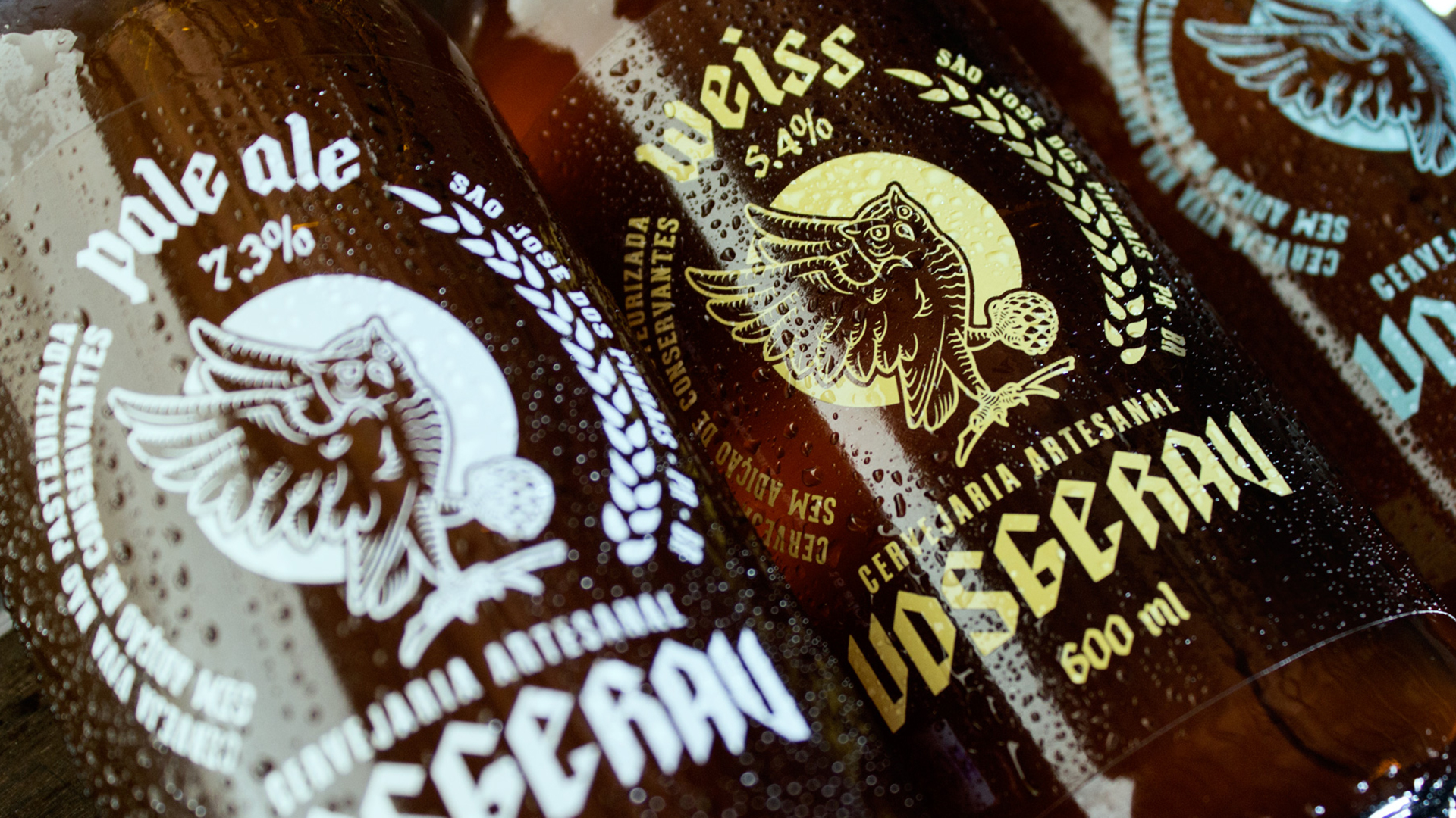
Labis Design opted for the use of typography making it much more versatile, based on the traditional Gothic feature and the semi-serif clean, bringing a modern character to the brand. The label tag was based on serigraphy, it has the element owl interacting with the element pine, translating the references indicated in a label that mixes the renaissance traditionalism with a modern composition with the typography.
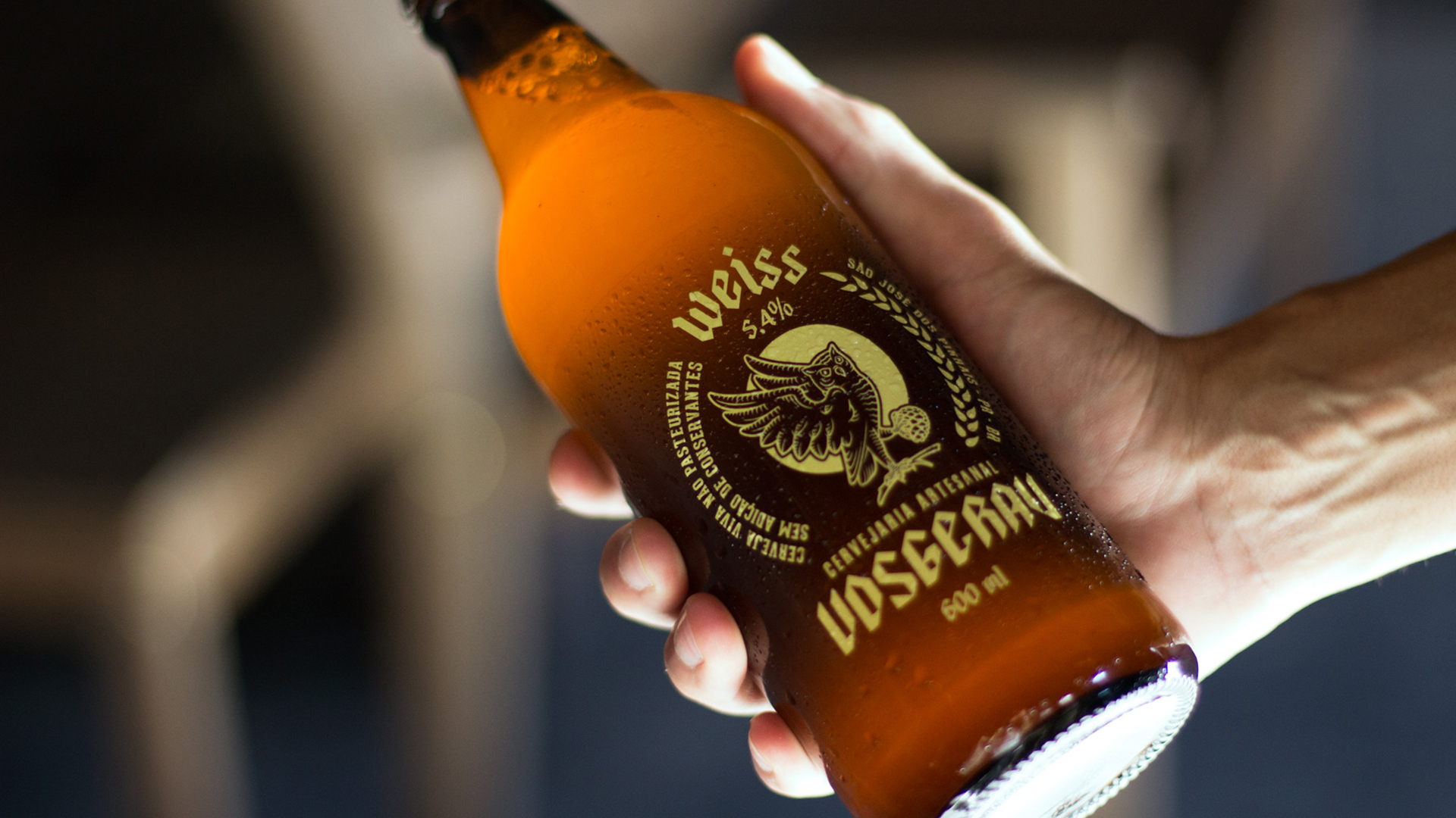
The label was based on serigraphy, it has the element owl interacting with the element pine, translating the references indicated in a label that mixes Renaissance traditionalism with a modern composition with typography.
The new label rescues the tradition of classic European beers, however, using a contemporary, cleaner and monochromatic style.
+55 41 3039 3344 - labis@labisdesign.com