
acf domain was triggered too early. This is usually an indicator for some code in the plugin or theme running too early. Translations should be loaded at the init action or later. Please see Debugging in WordPress for more information. (This message was added in version 6.7.0.) in /home1/labis658/public_html/wp-includes/functions.php on line 6170


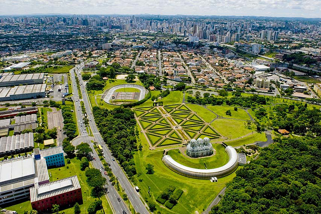
For some time Curitiba has been taking a position to occupy the city and to appreciate its particularities. The Mayor Gustavo Fruet helped this movement with a participative management, focused on the collective. Sérgio Pires’ planning management has an emphasis on valuing art and design. The Curitiba citizen in turn, loved the idea and is increasingly in the streets, interacting and appropriating what is his. When there is feeling of belonging, there is participation that generates love and care.
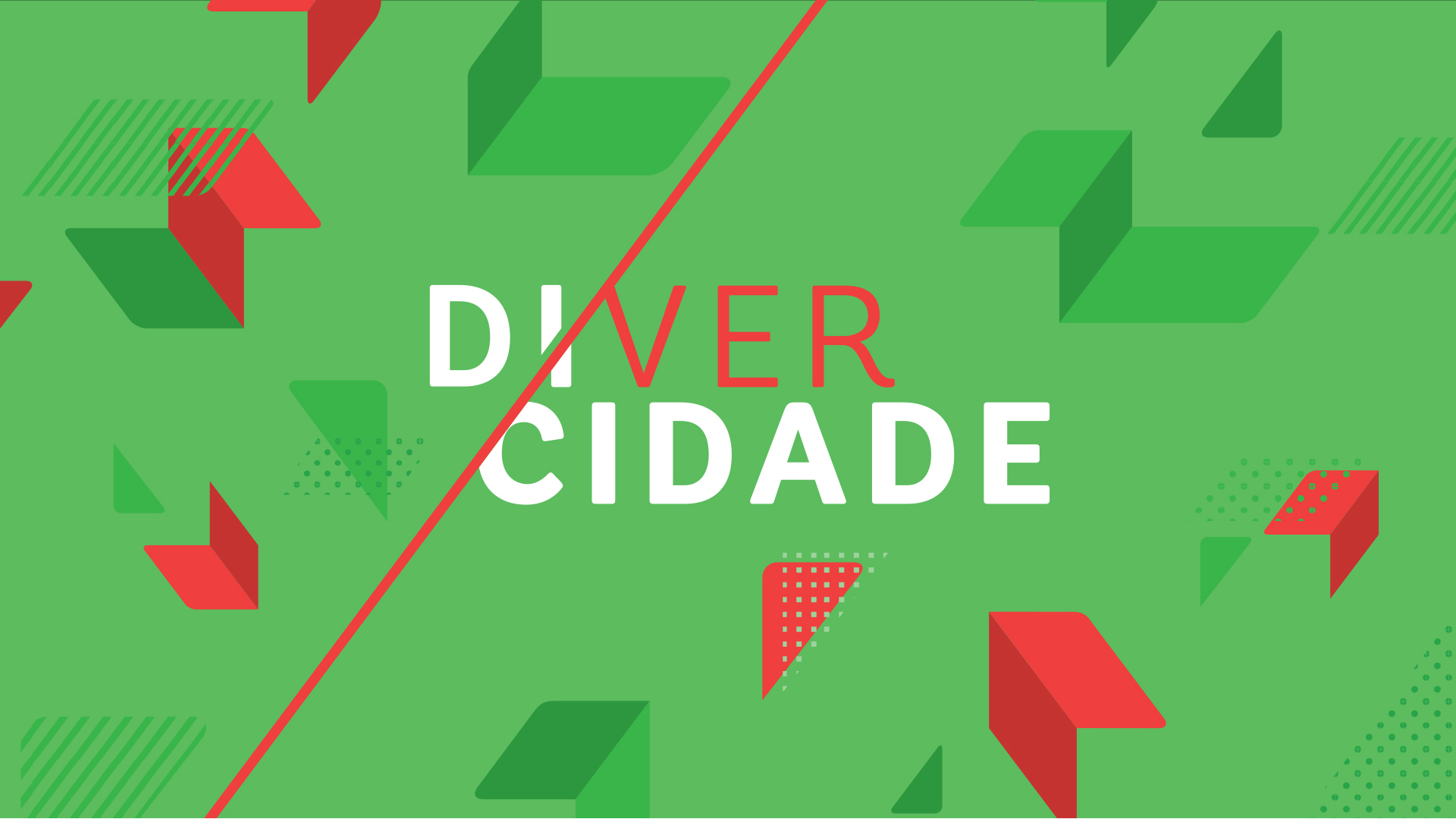
The Di.Ver.Cidade project comes to add to this feeling of love for Curitiba. Involving architects, urban planners, landscape designers and plastic artists from three generations will show the most attentive and different looks of love for Curitiba through a creative economy: good for professionals and good for the city.
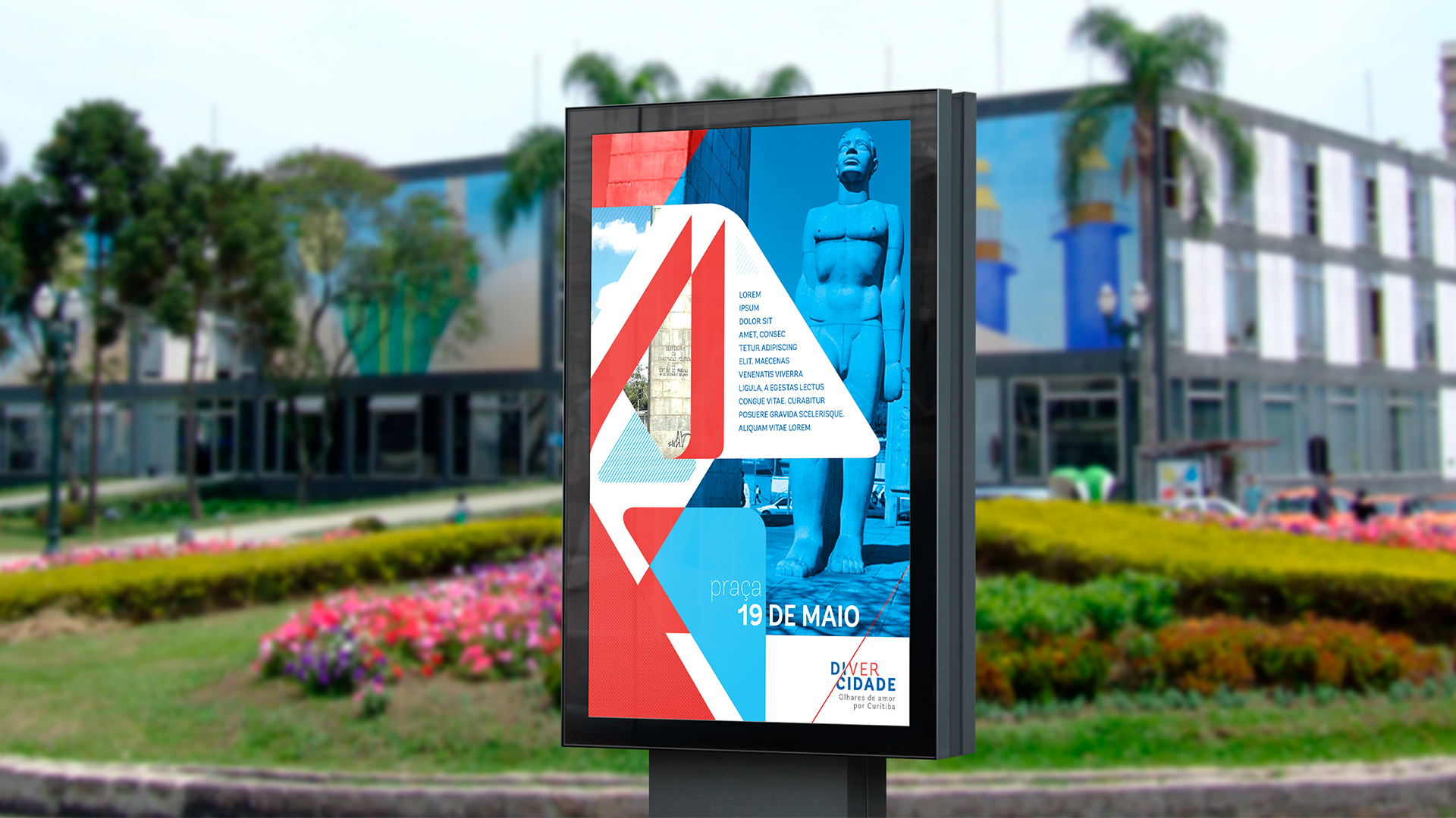
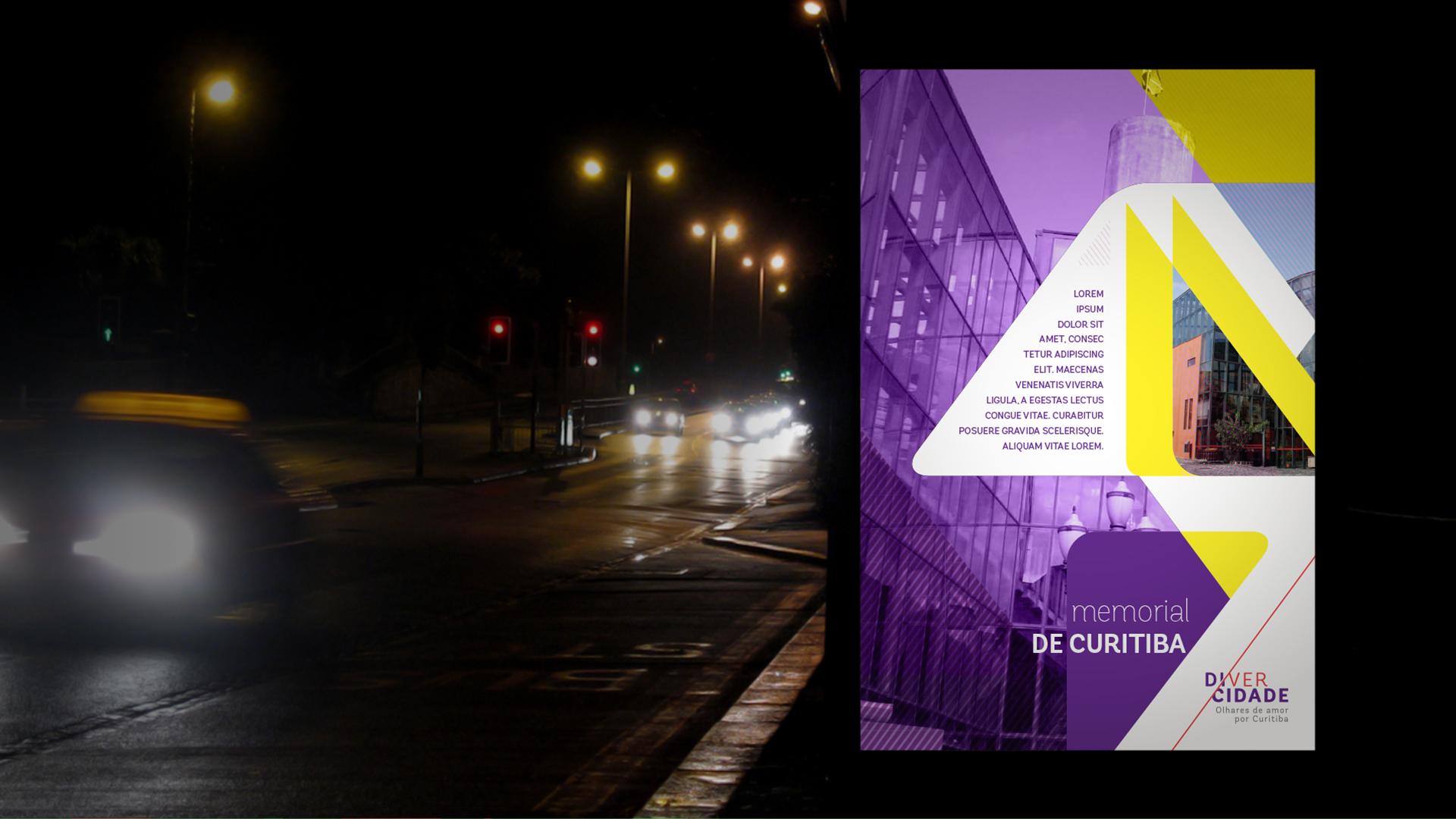
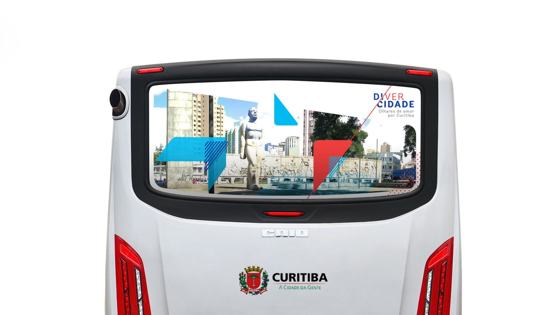
Labis Design was responsible for creating the visual identity and signage of the project, and developed such steps through Brand Language Design, which provided us with foundation and support to create all the necessary materials.
In the development of the visual identity of the Di.Ver.Cidade project, all communication seeks to value the beauties that the route chosen can provide to the citizen of Curitiba, arousing his pride in the city and promoting a movement to rescue the importance of caring for his own.
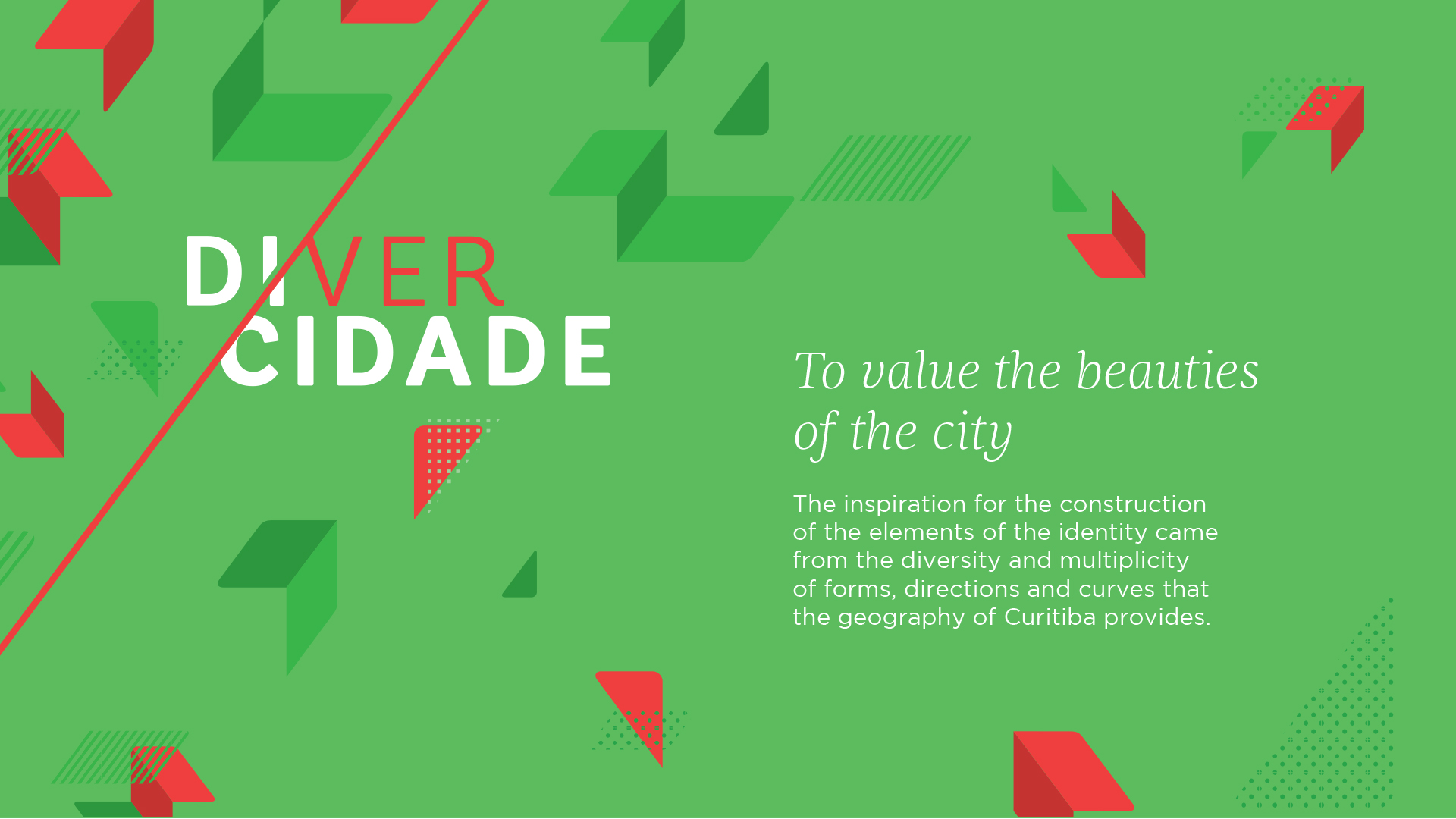
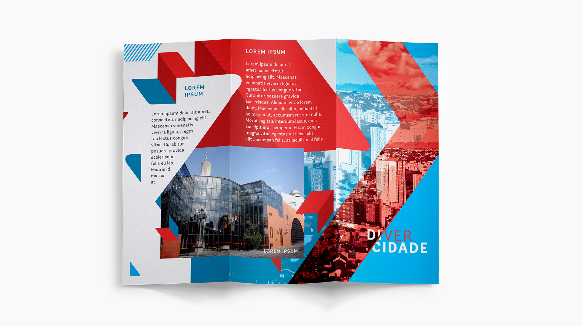
The inspiration for the construction of the elements of identity came from the diversity and multiplicity of forms, directions and curves that the geography of Curitiba provides.
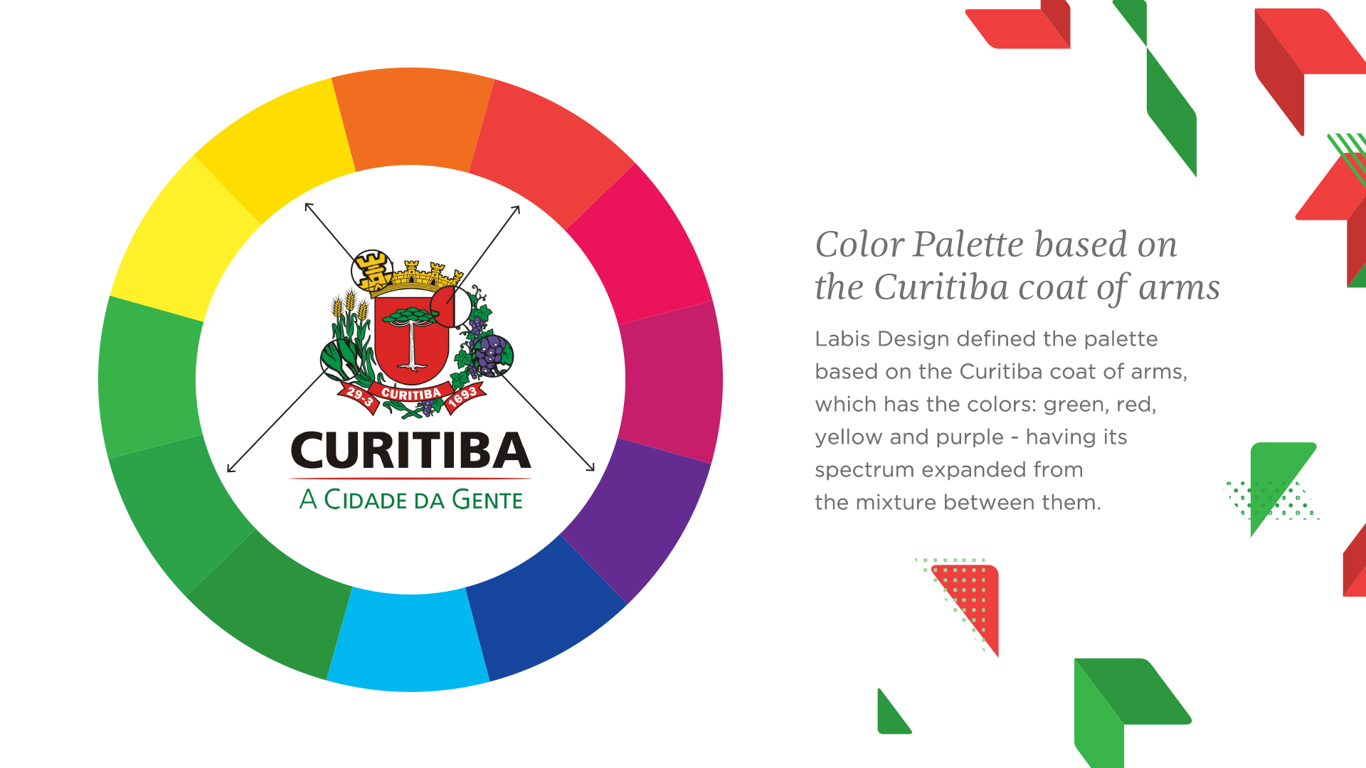
Labis Design defined the colors palette based on the Curitiba coat of arms, which the colors are: green, red, yellow and purple – having its spectrum expanded from the mixture between them.
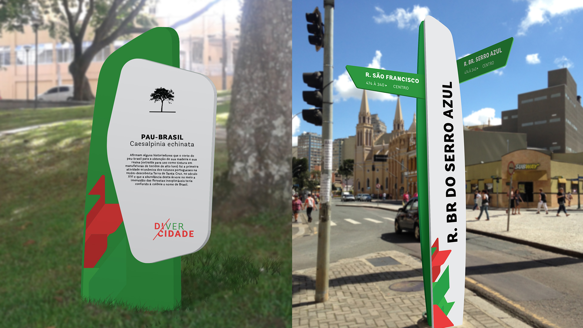
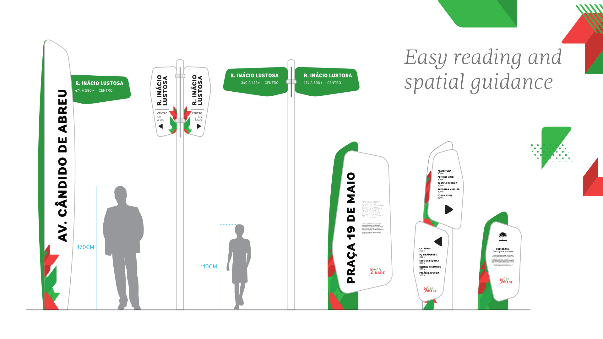
The signs were created to facilitate the visualization of the information, besides having elements that integrate with the urban photography of the city, provided to both the pedestrian, cyclist and driver a easy reading, knowledge and spatial guidance.
+55 41 3039 3344 - labis@labisdesign.com