
acf domain was triggered too early. This is usually an indicator for some code in the plugin or theme running too early. Translations should be loaded at the init action or later. Please see Debugging in WordPress for more information. (This message was added in version 6.7.0.) in /home1/labis658/public_html/wp-includes/functions.php on line 6170


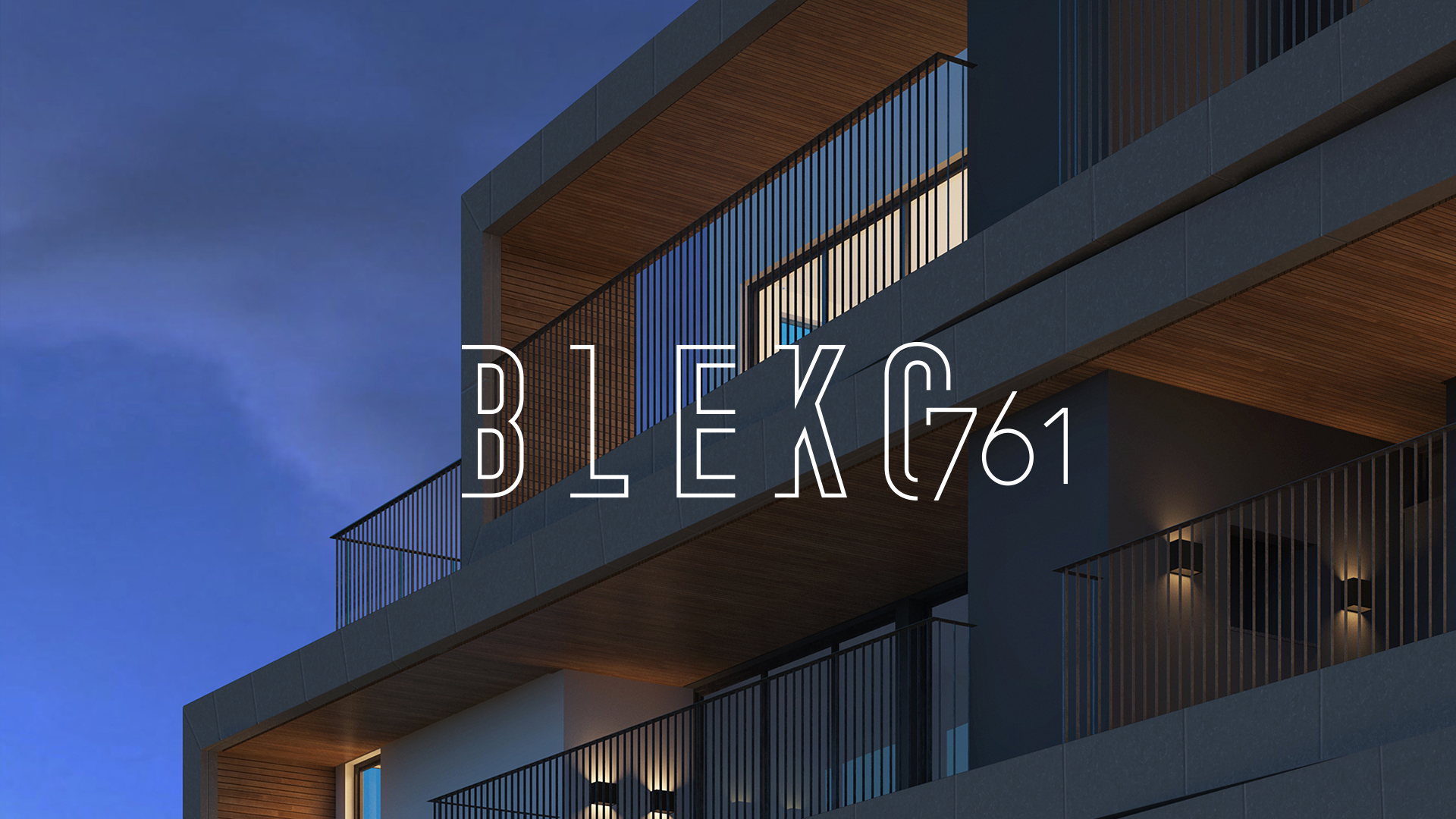
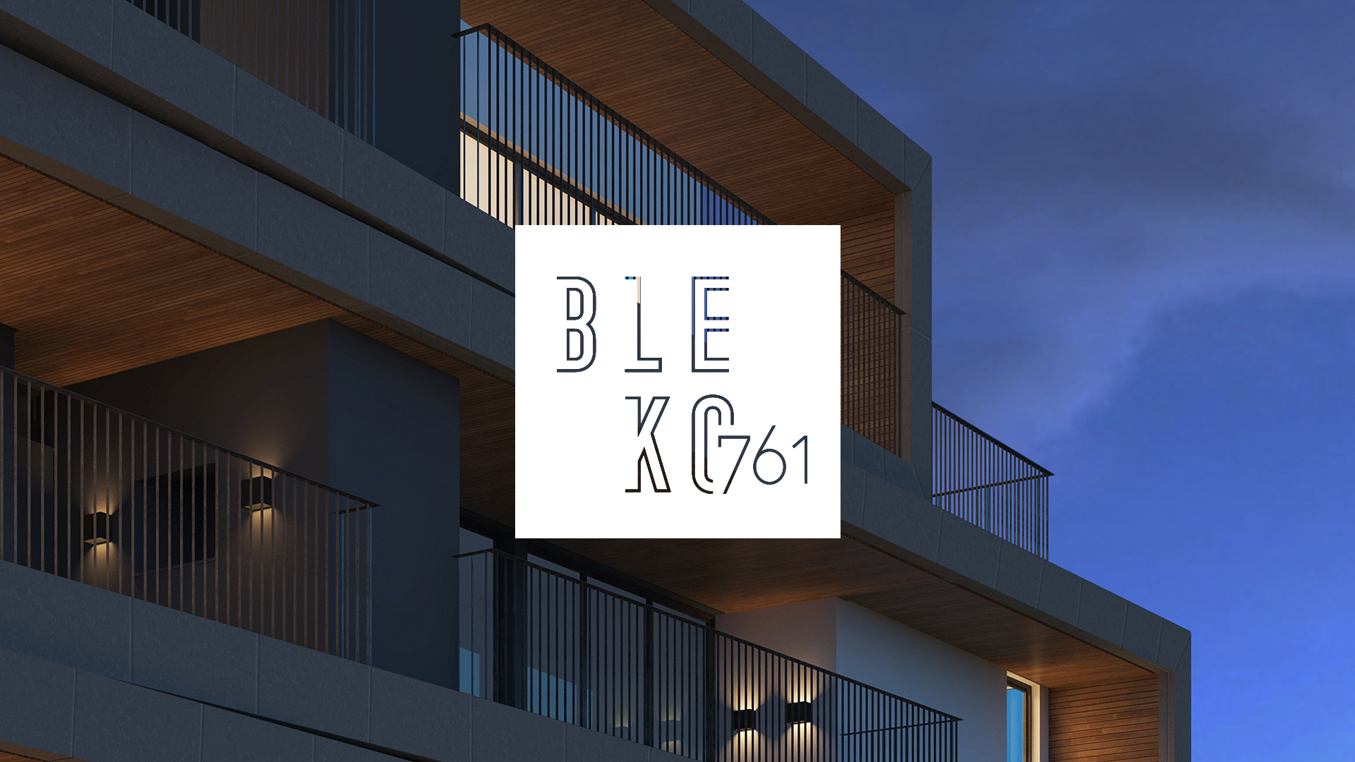
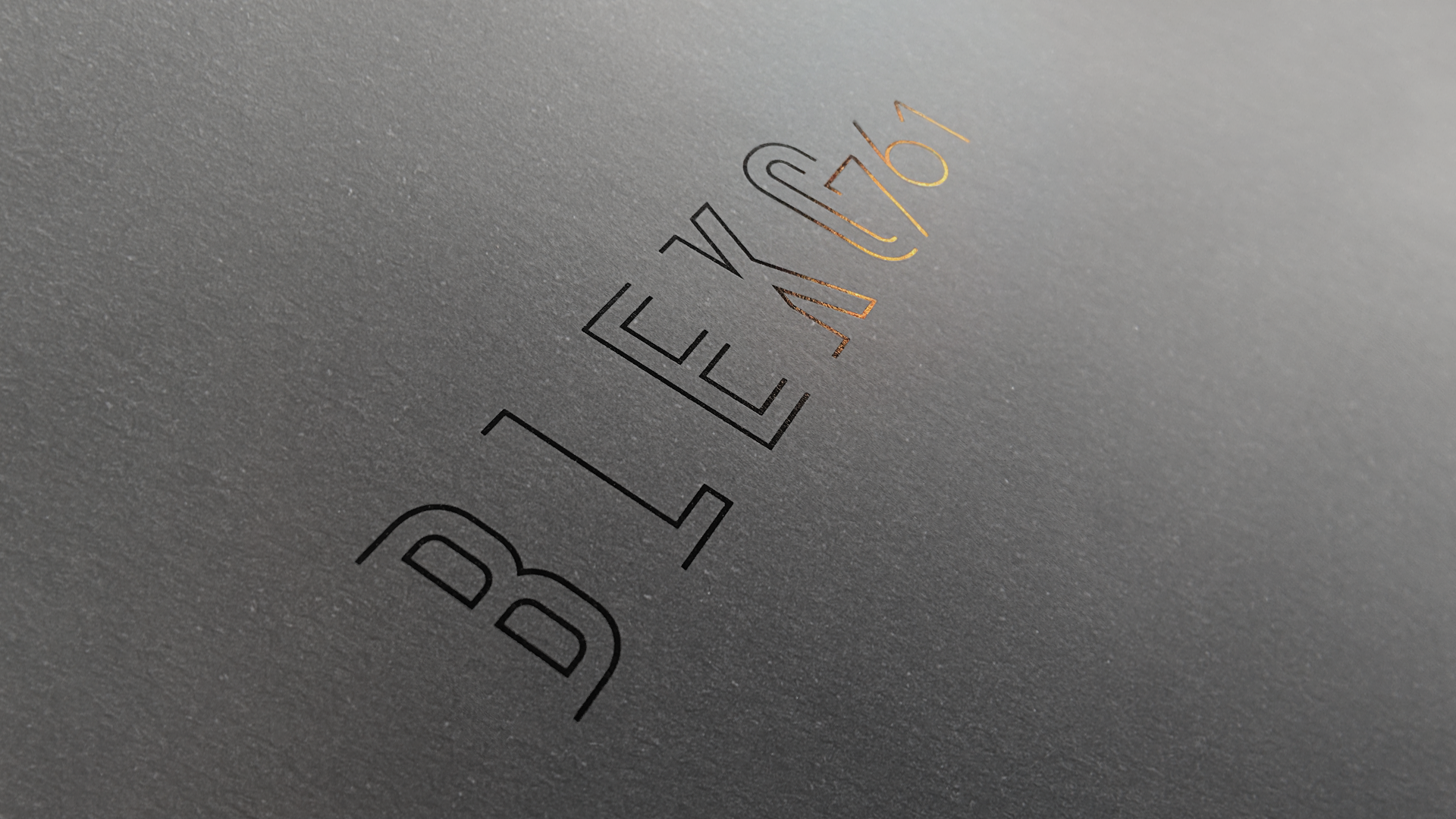
Neolar offers distinct real estate properties at privileged locations, always mindful of its clients demands and keeping up with trends in a market that is in constant evolution. The projects focus on these three pillars: engineering, architecture and design. Labis Design developed, through Brand Language Design, the visual identity of Bleko761, a new building from Neolar.
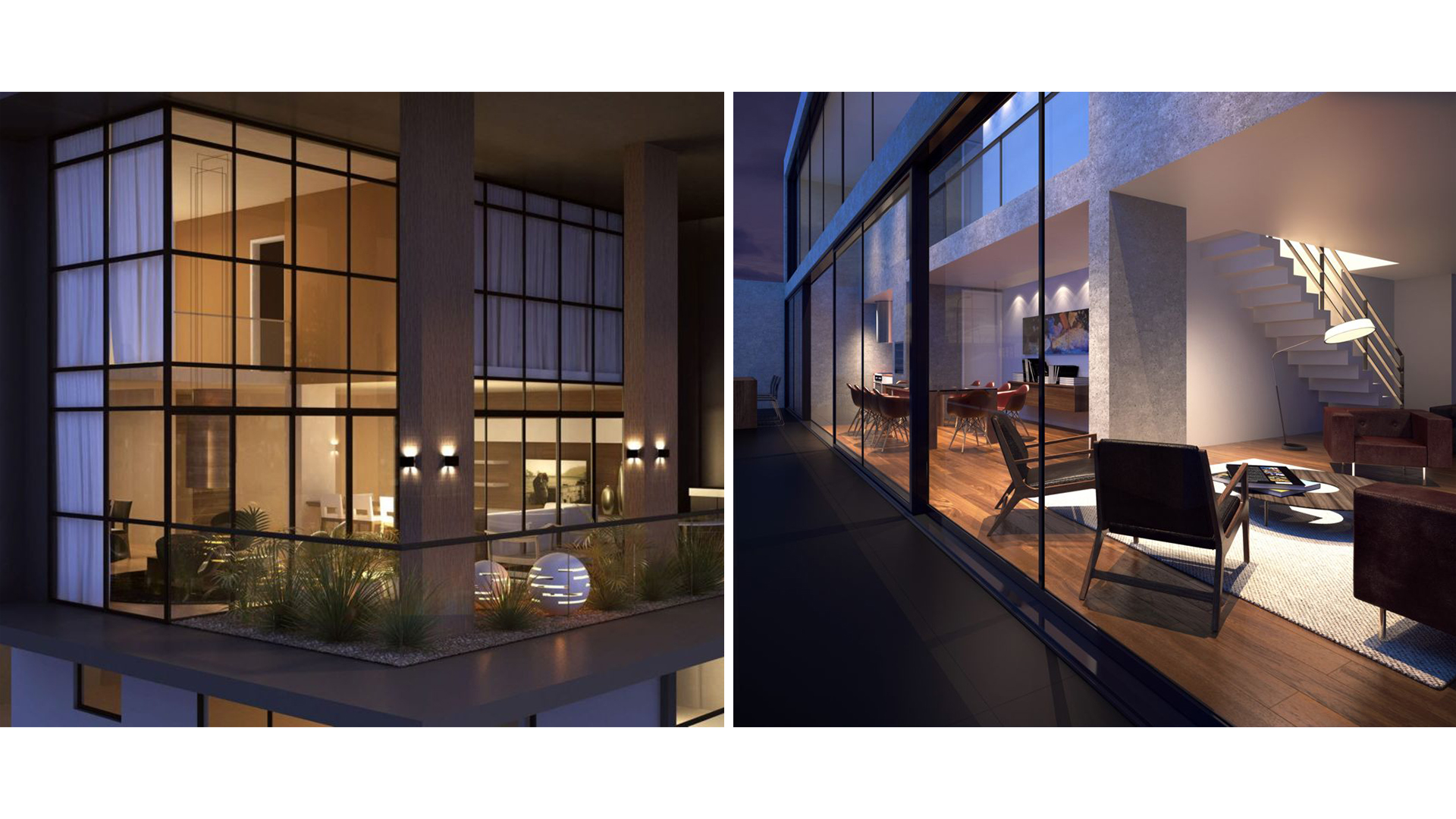
It is a project signed by the architect Sabrina Slompo and interior designer Fernanda Cassou. While most buildings present impersonal common areas, this building has inviting spaces that encourage their use.
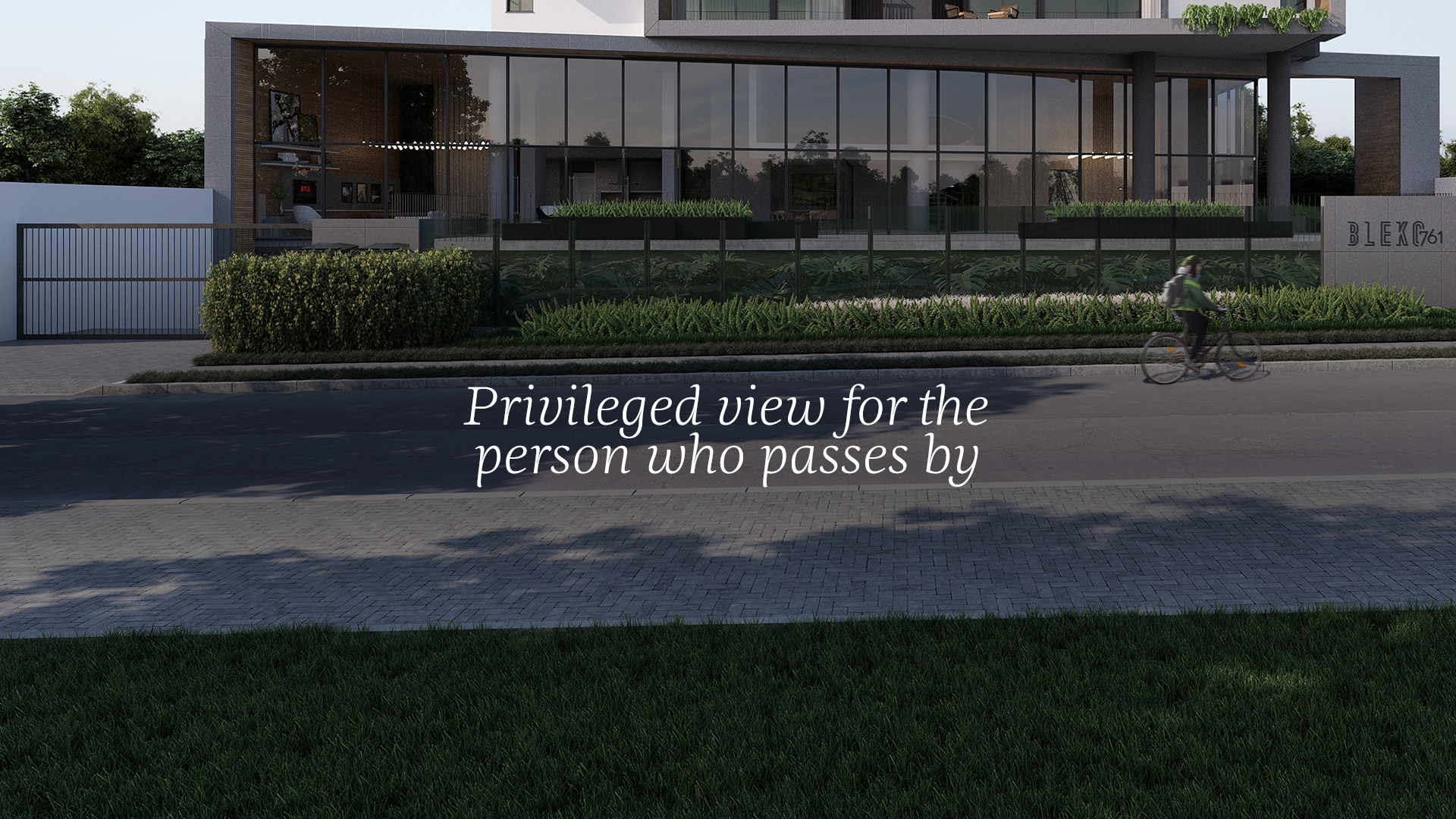
For the building to be more participative of the urban landscape, it was designed to privilege the view of the one who passes by.
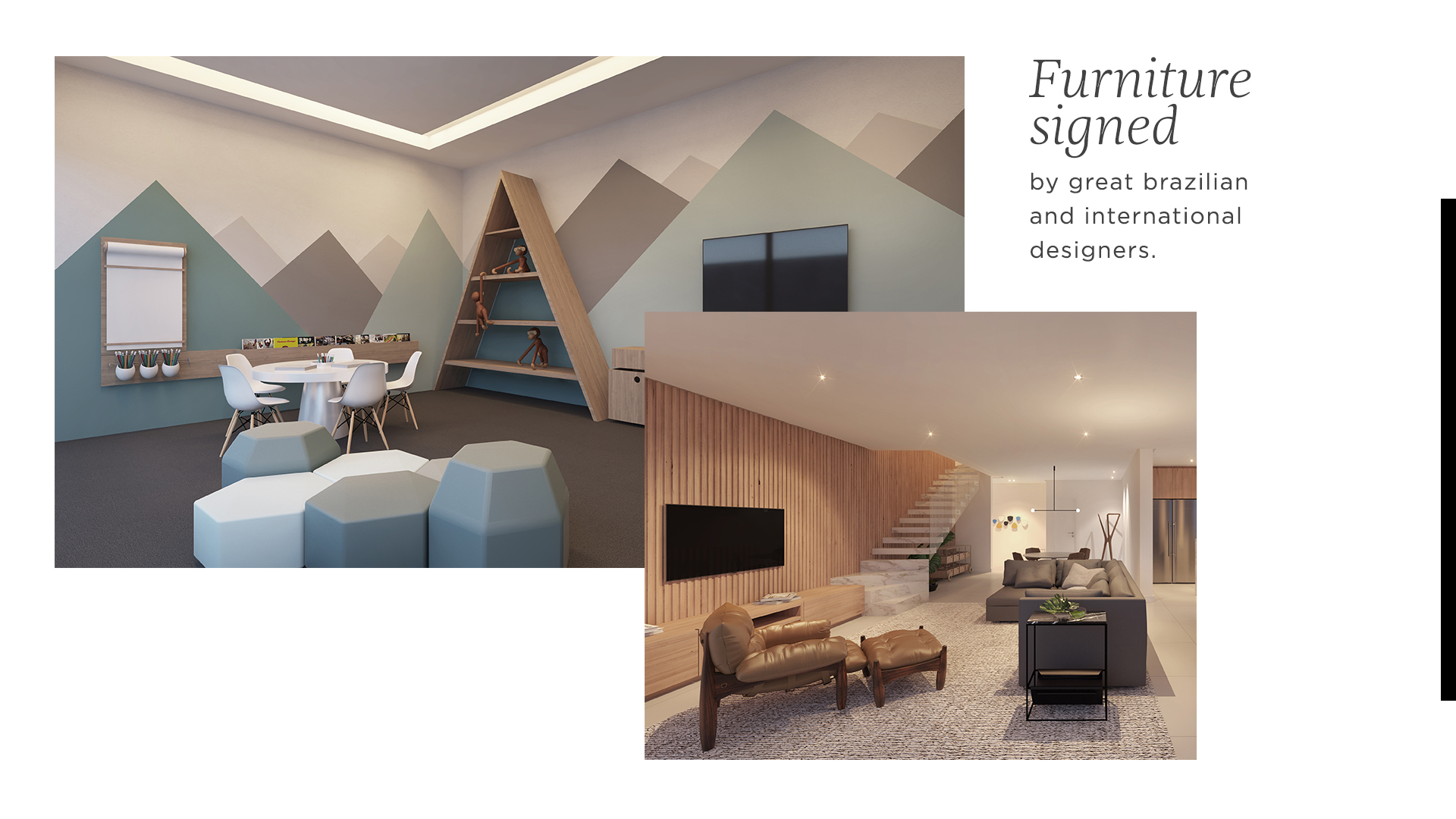
The conviviality areas received special attention, decorated and equipped with furnish signed by great brazilian and international designers.
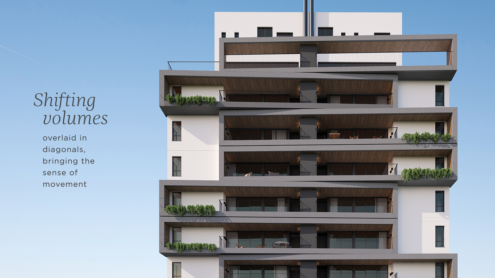
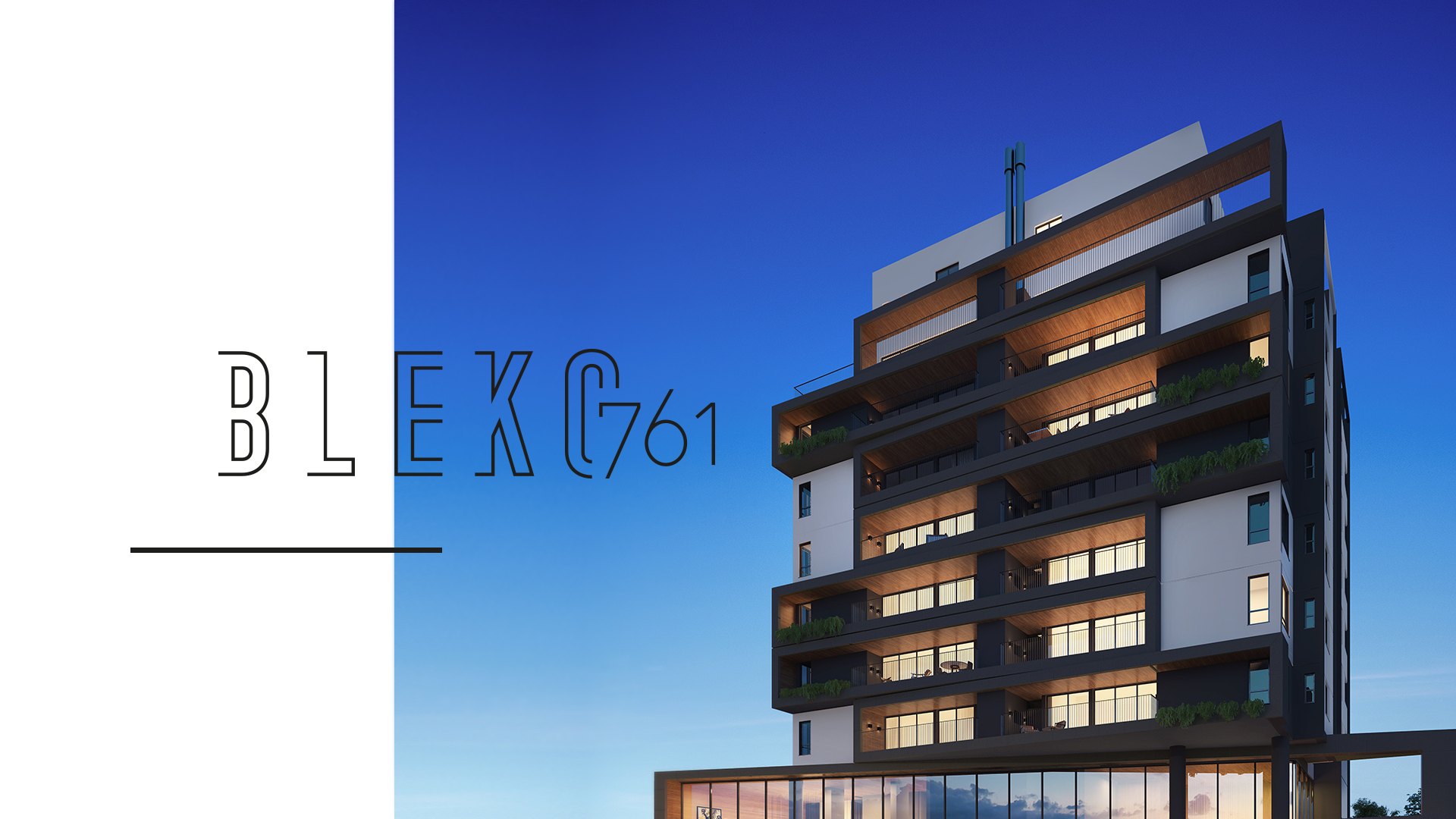
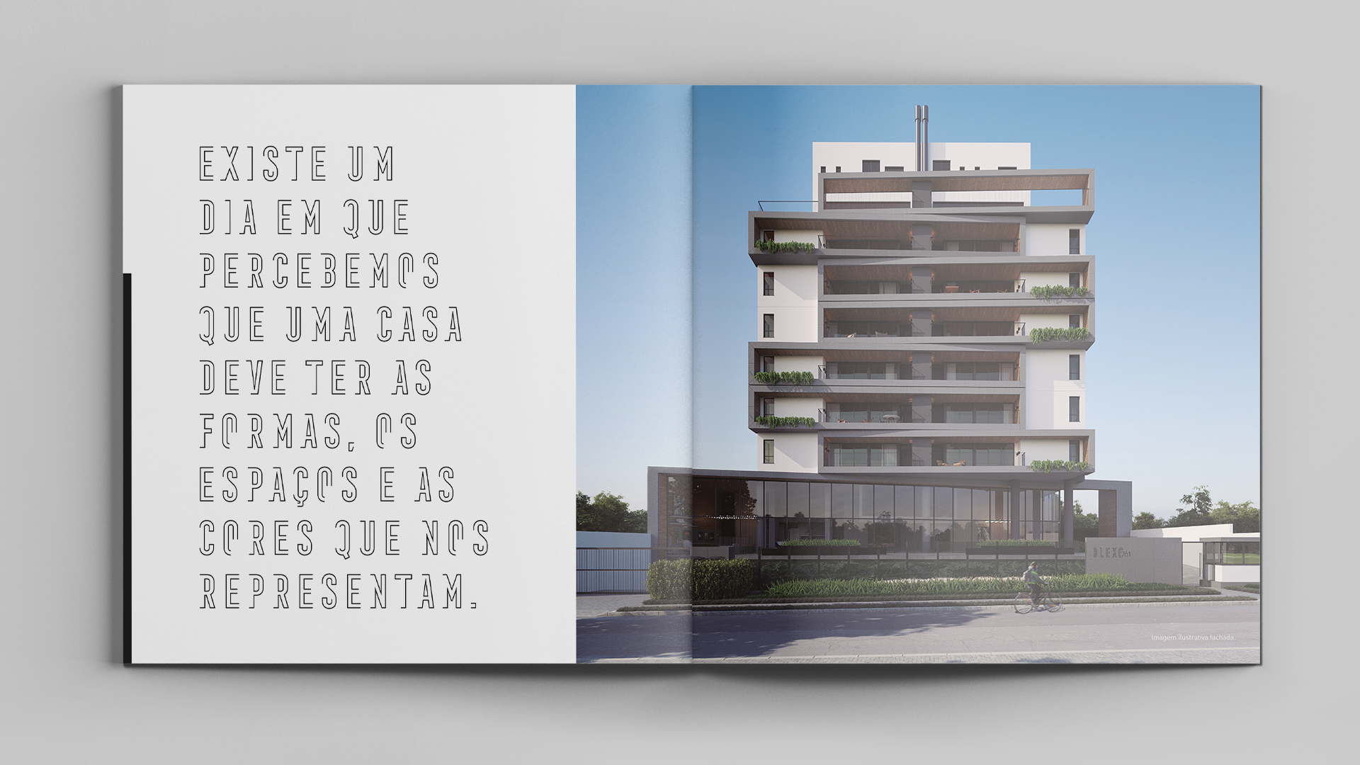
The facade has a diagonal in relation to the direction of the street and sizeable dimensions, which is uncommon in real estate market constructions.
In the structure of the building, the diagonal shifting of volumes brings the sense of movement and highlights each level.
Labis Design developed the logo for the new building, in addition to a visual identity that conveys the brand values and is compatible with the target audience expectations. The new visual identity contemplated the study and graphic concept of the building’s wayfinding system (facade, apartment numbers, garage and common area identification), and sales catalog.
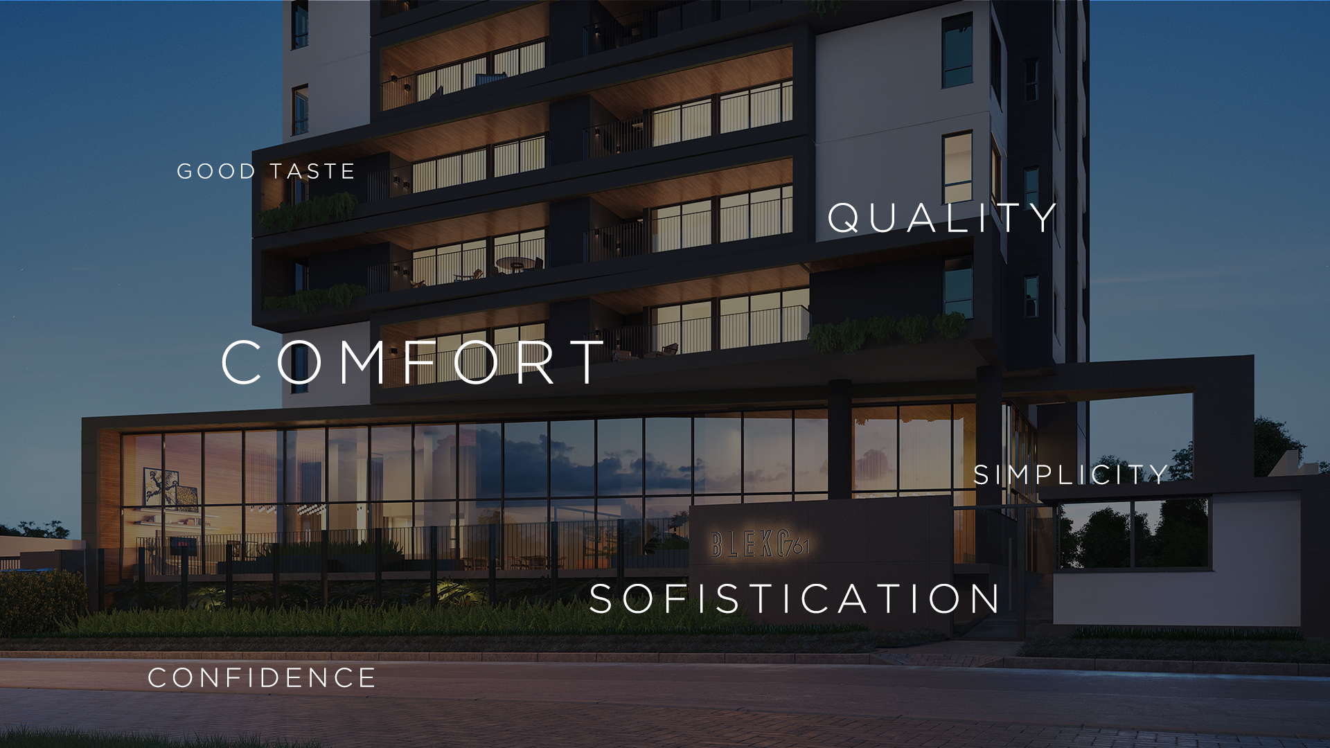
Architects, interior designers, landscape designers, engineers were put together to think about every detail. The final result is a project with wide, airy spaces and common areas filled with design, architecture and innovation. Therefore, values such as: comfort, quality, sophistication, simplicity, good taste and confidence are transmitted to the public with the creation of the new visual identity.
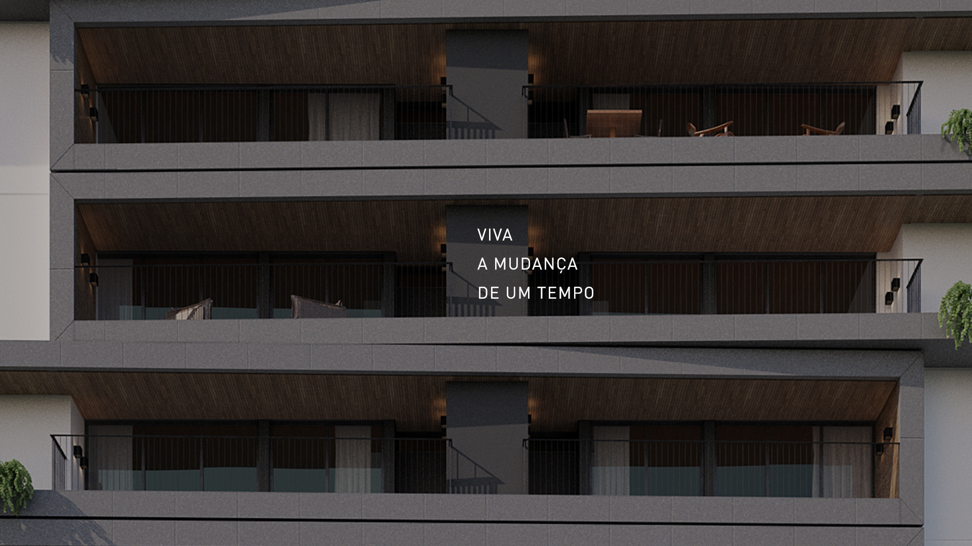
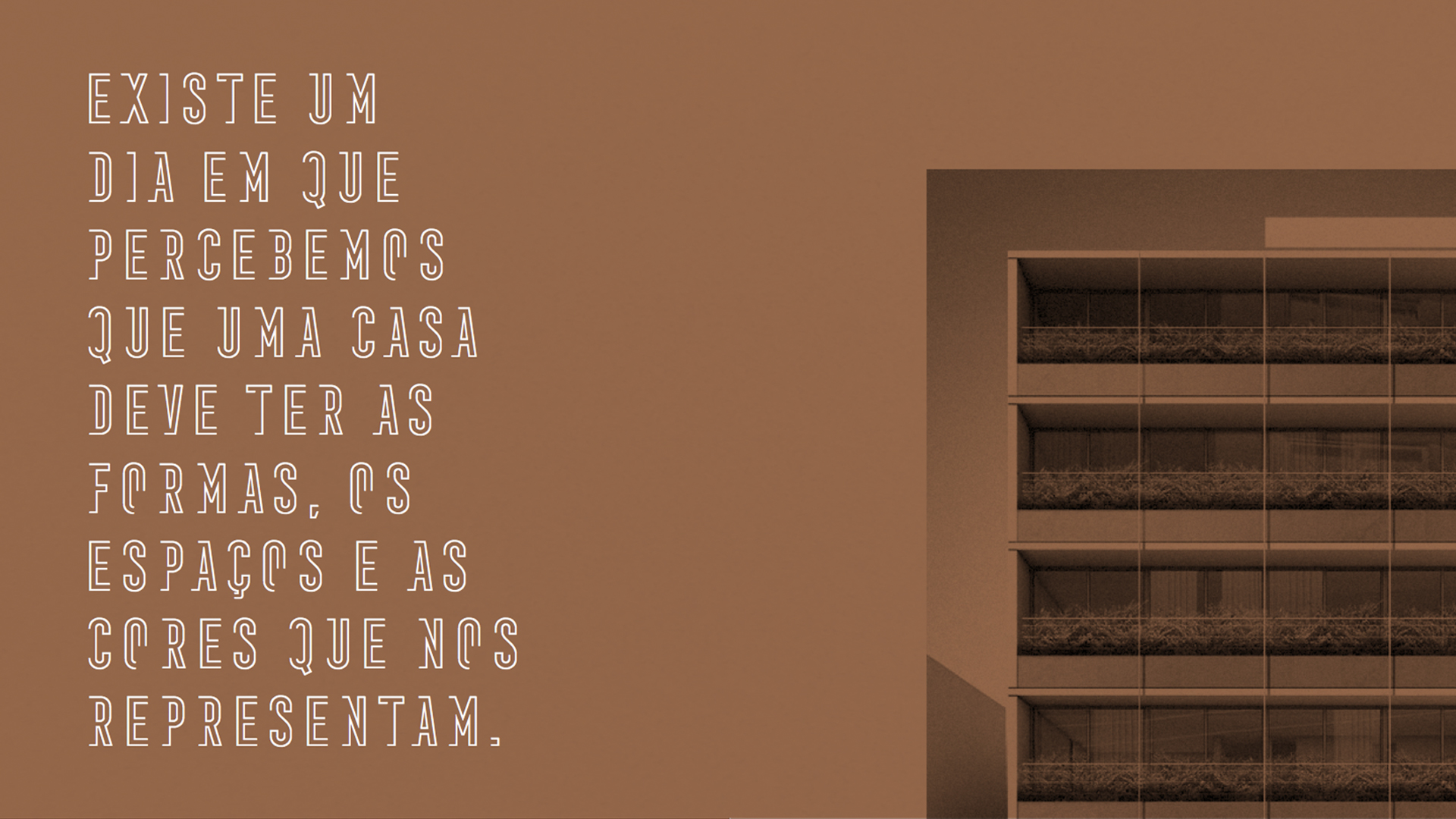
When we decide to move to another house, we are willing to enter a new phase of life, either because we are going to live alone, make the family bigger or because we planned to move to some place better.
The day we decide to move is very symbolic. Moving allow us diverse approaches, paths and interpretations, and that is what guided our concept for the visual identity, which has a human and emotional approach.
We brought the colors and textures used in the construction of the building to the visual identity of the brand.
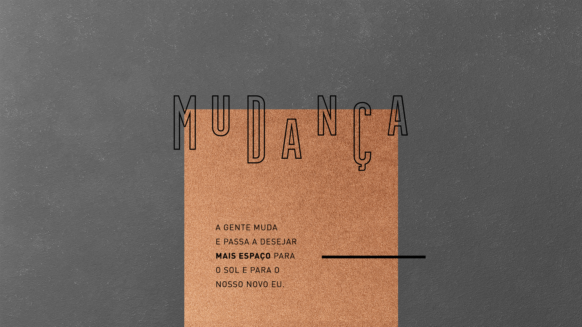
It references the architectural lines of the building, which are straight and present blank spaces as a result of the balconies’ visual arrangement. The interruptions formed by the blank spaces were used to give movement to the brand.
We opted for uppercase letters because, in comparison to lowercase, these have more geometric structures and better performance at smaller sizes.
The letter spacing was purposely increased in order to give the sense of
amplitude, just like the building, that has wide and bright rooms.
Each letter was designed specially to convey more personality and dynamism, resulting in a strong, modern and current brand.
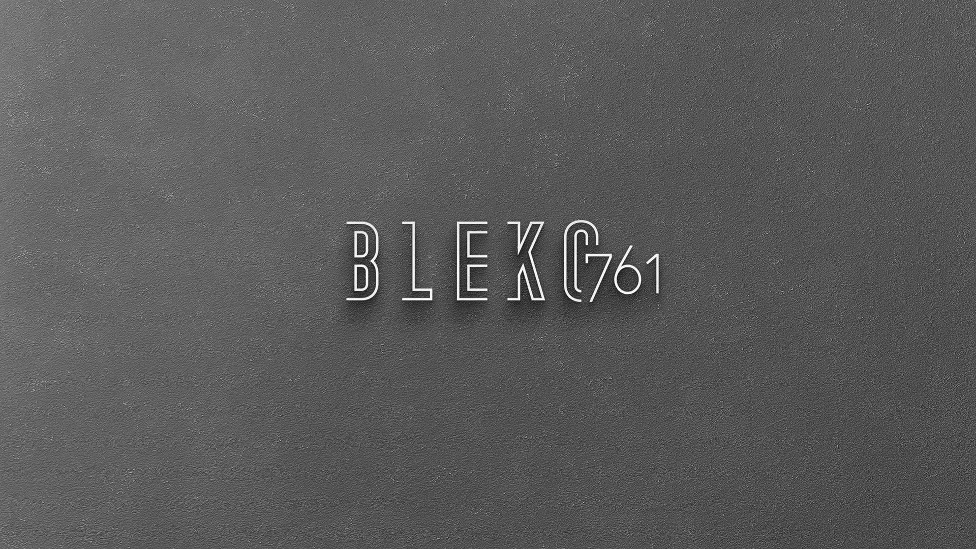
Labis Design developed a typeface specially for this project, Bleko Sans Display.
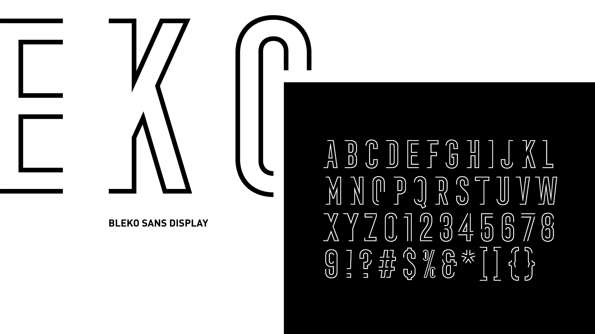
Its forms derive from the structures and patterns drawn for the logo, then applied in a wider range of characters using the same attributes, allowing it to be used in different languages and suitable for different materials.
To stay away from real estate usual practices and bring more refinement to the project, we suggested the use of cut-out bronze plates with apartments numbers and pictograms for the wayfinding system.
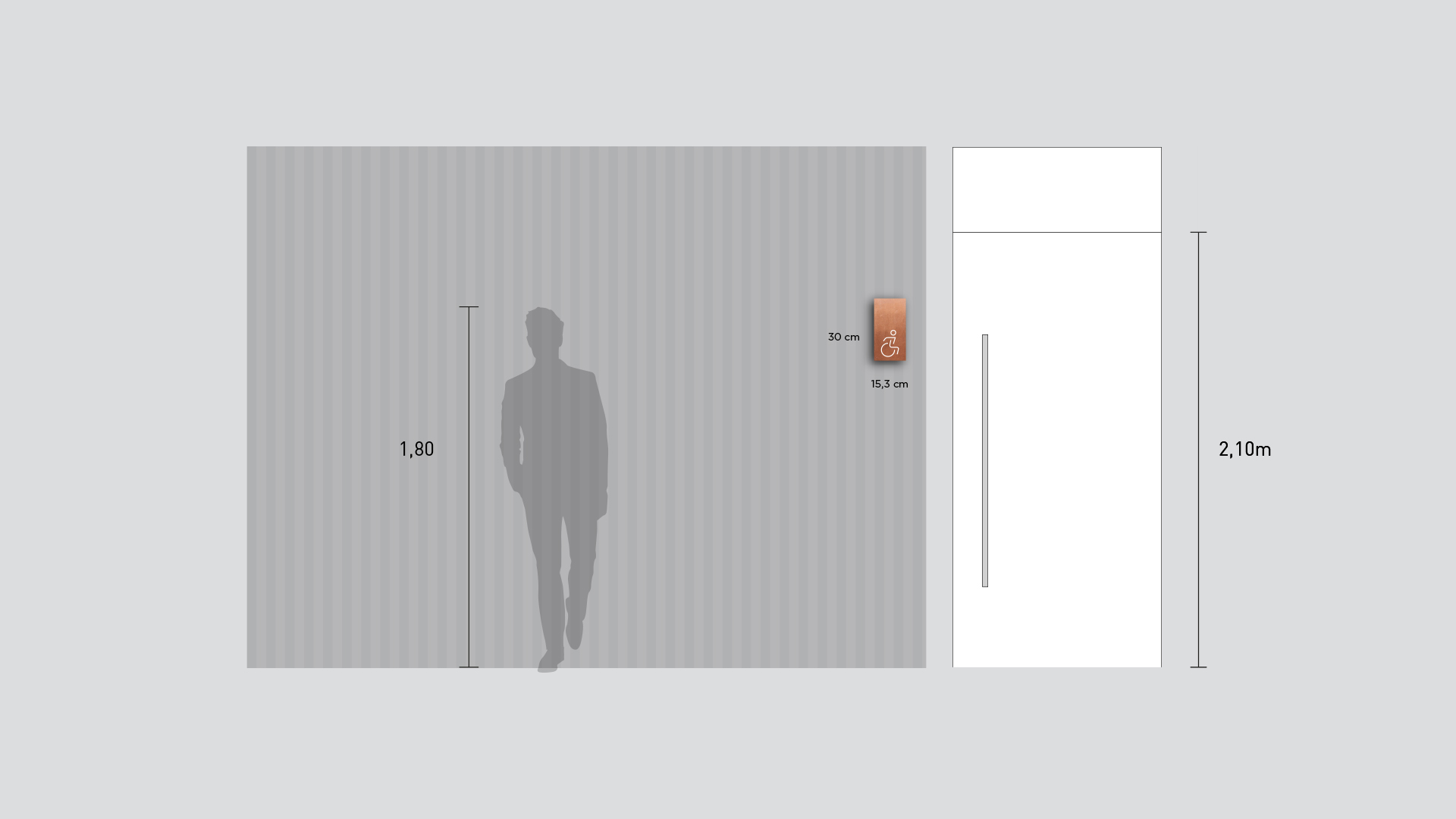
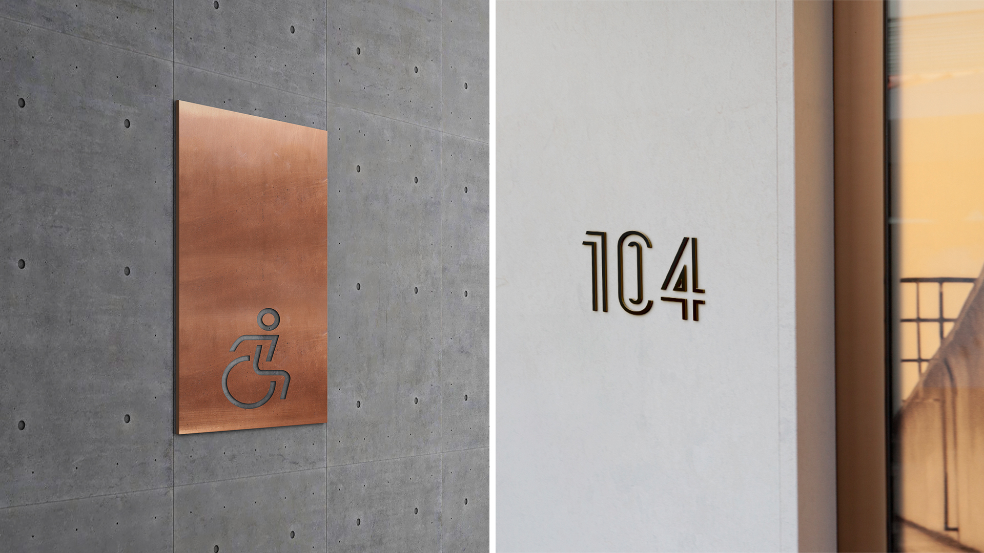
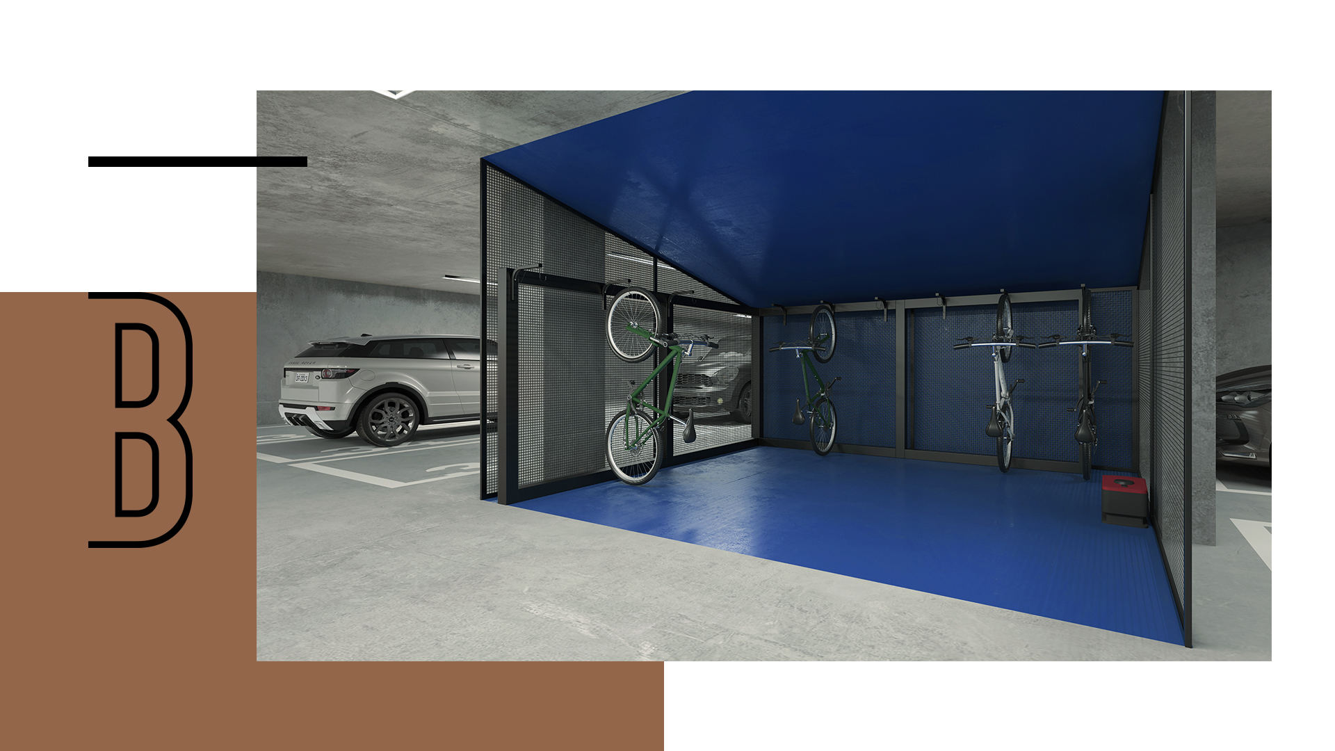
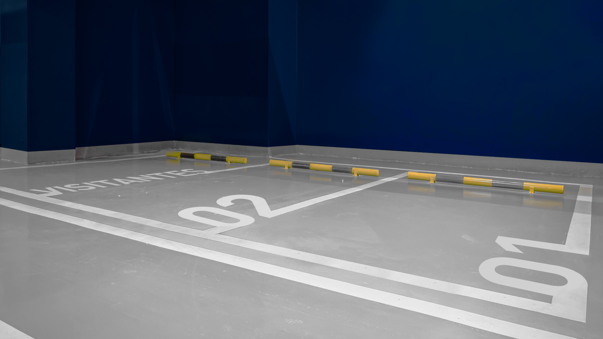
The parking spots were delimited and numbered with a geometric sans-serif that goes along with the main typeface.
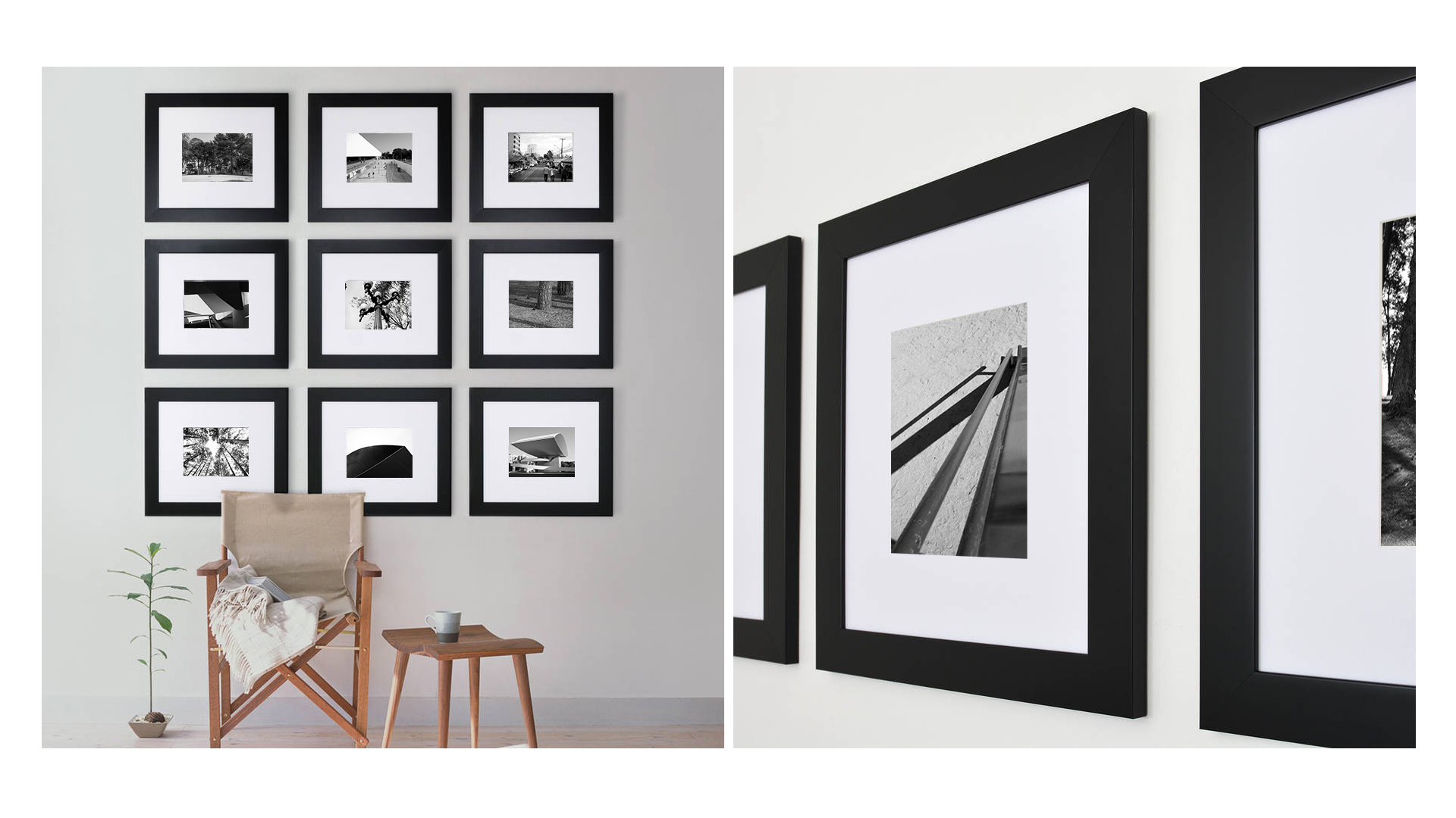
We invited an artist specialized in architecture and lifestyle photography to explore the Juveve neighborhood.
With a sensitive eye, walking by streets, corners and unexpected places, photographer Ricardo Perini revealed images that value the local culture and show to our eyes details that often go unnoticed.
This series of photographs was used in promotional materials of the project and in the future will be framed in the common areas, becoming part of the decoration.
Neolar understands design as something that goes beyond aesthetics, but as a tool that gives meaning to every detail. Bearing this in mind, the catalog was developed with 3 different kinds of paper to provide the future residents a new experience as they go through the pages.
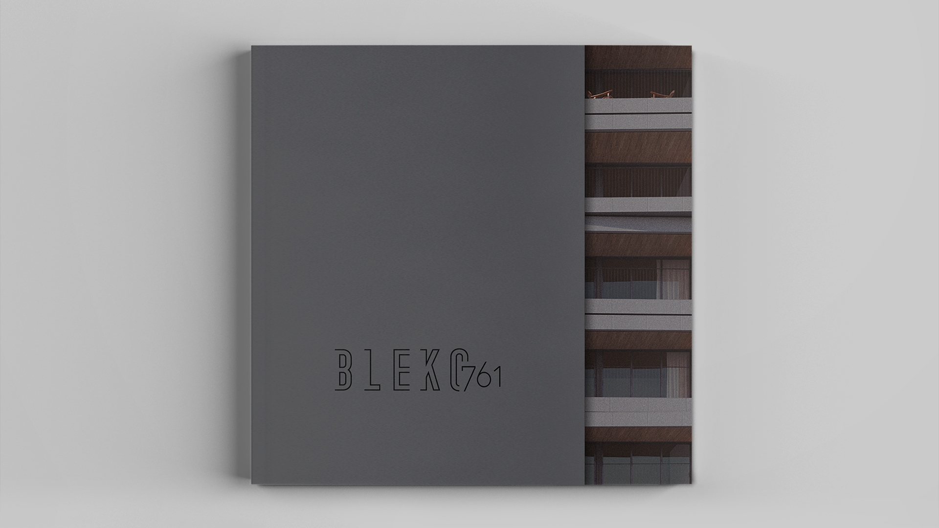
The cover has a special cut in Marrakech Color Plus paper, representing the cement used as a finish in the building. The logo is applied with hot stamping in order to produce a metal effect.
In the inside pages, we mixed two papers to create contrast. The first one is Couché, a coated paper with smooth touch that provides vibrant colors in the printing.
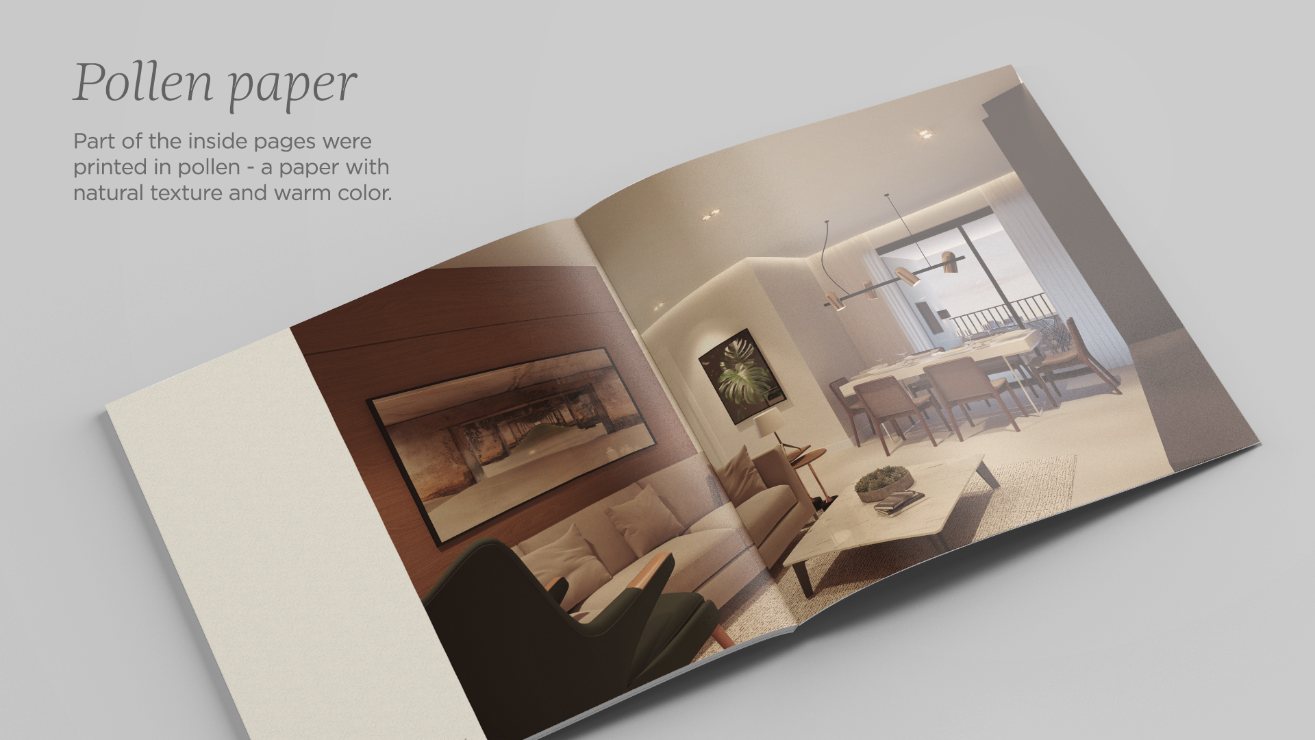
Followed by Pollen, used in the pages with blueprints of the building, which is an uncoated paper that has a slightly yellow hue, bringing comfort to the eye and reminding of initial architectural sketches of the project.
The combination of the special cut cover with papers in different styles and grammage creates a meaningful final result in which not only the content of the catalog will be remembered but also the catalog as a graphic piece that lives up to the many distinct aspects of Bleko761.
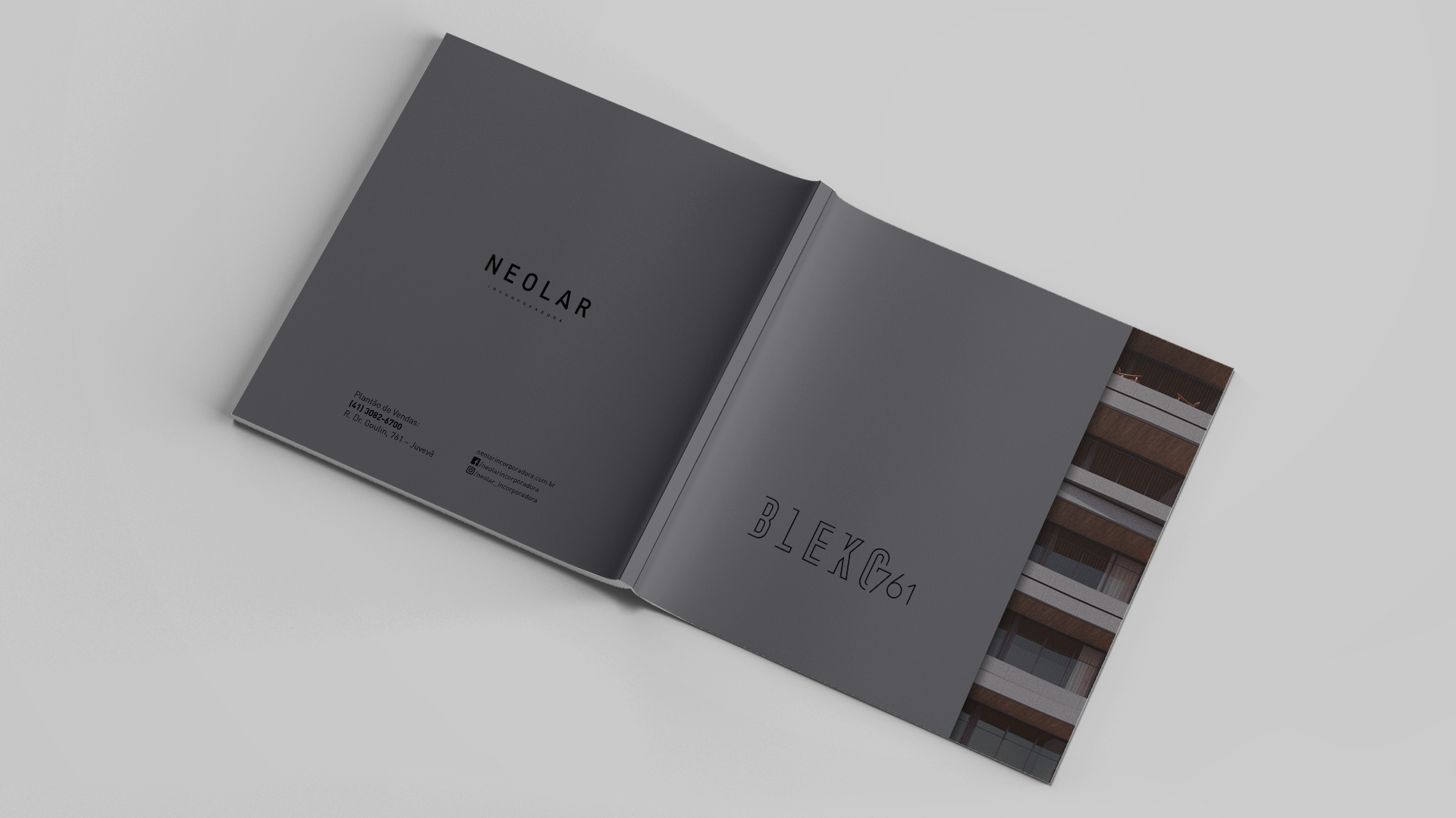
+55 41 3039 3344 - labis@labisdesign.com