
acf domain was triggered too early. This is usually an indicator for some code in the plugin or theme running too early. Translations should be loaded at the init action or later. Please see Debugging in WordPress for more information. (This message was added in version 6.7.0.) in /home1/labis658/public_html/wp-includes/functions.php on line 6170


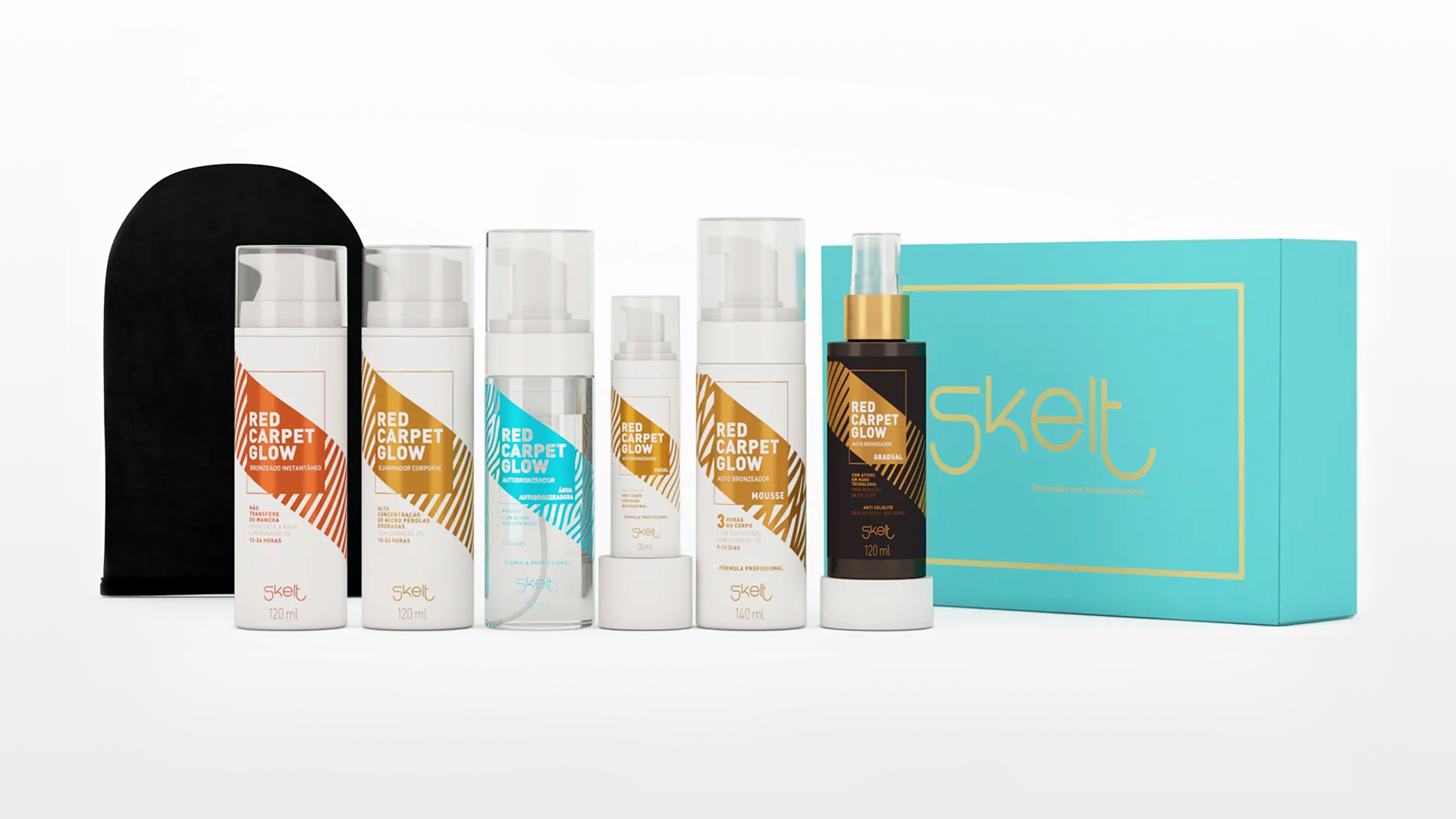
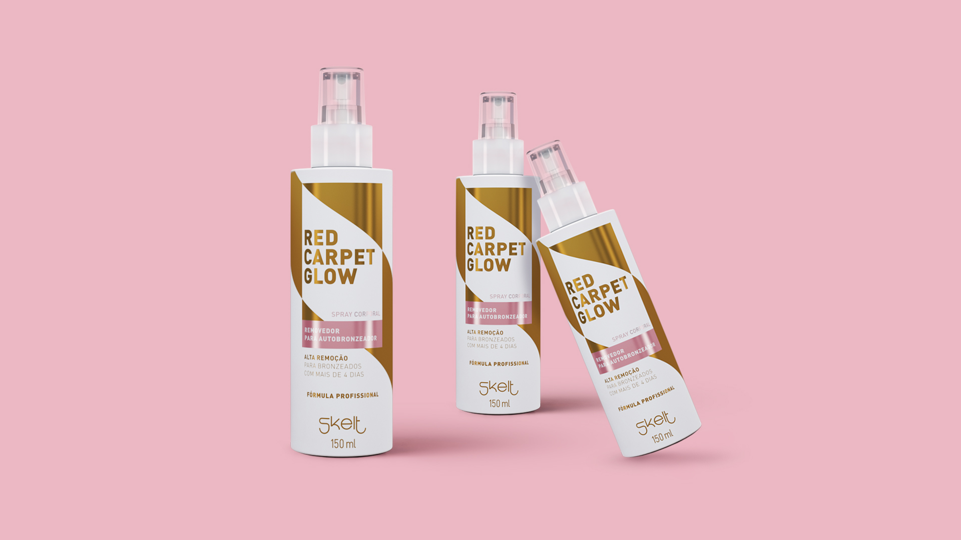
Before defining creative paths, we analyze packaging and its effects on consumer behavior. We understand that Skelt’s clean identity, as well as the horizontal stripe as a striking element of the packaging, should be maintained in the products, creating quick identification of the public.
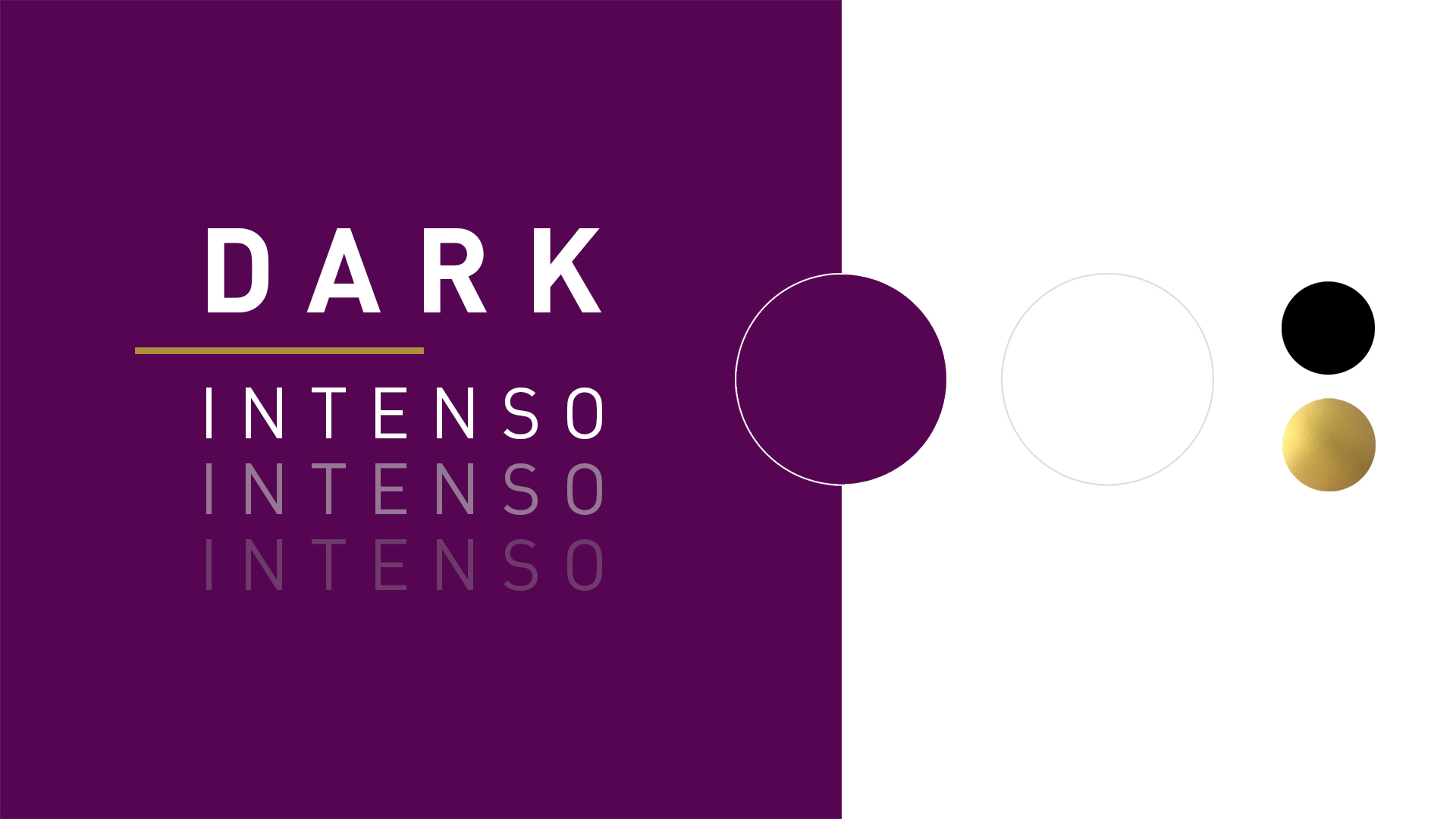
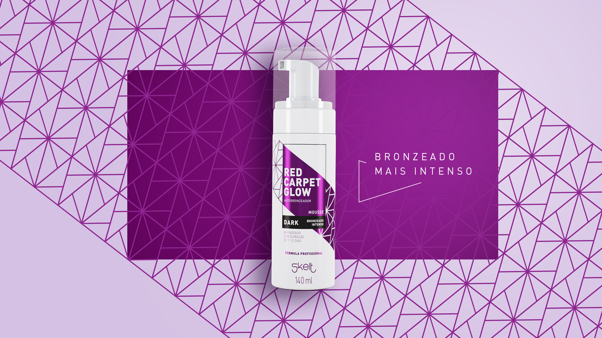
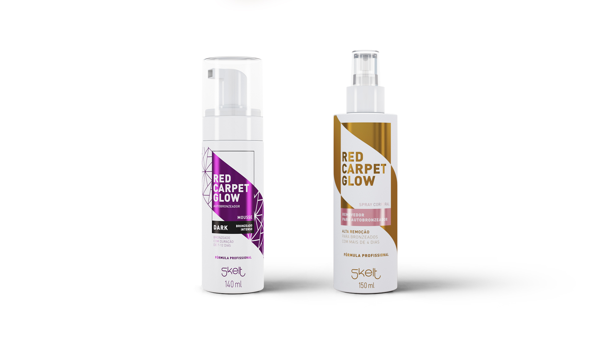
The new products in the line bring the promise of a more intense tan, we went to the dictionary to look for the essence of that word: “which manifests itself or is felt strongly, vigorously, with abundance”.
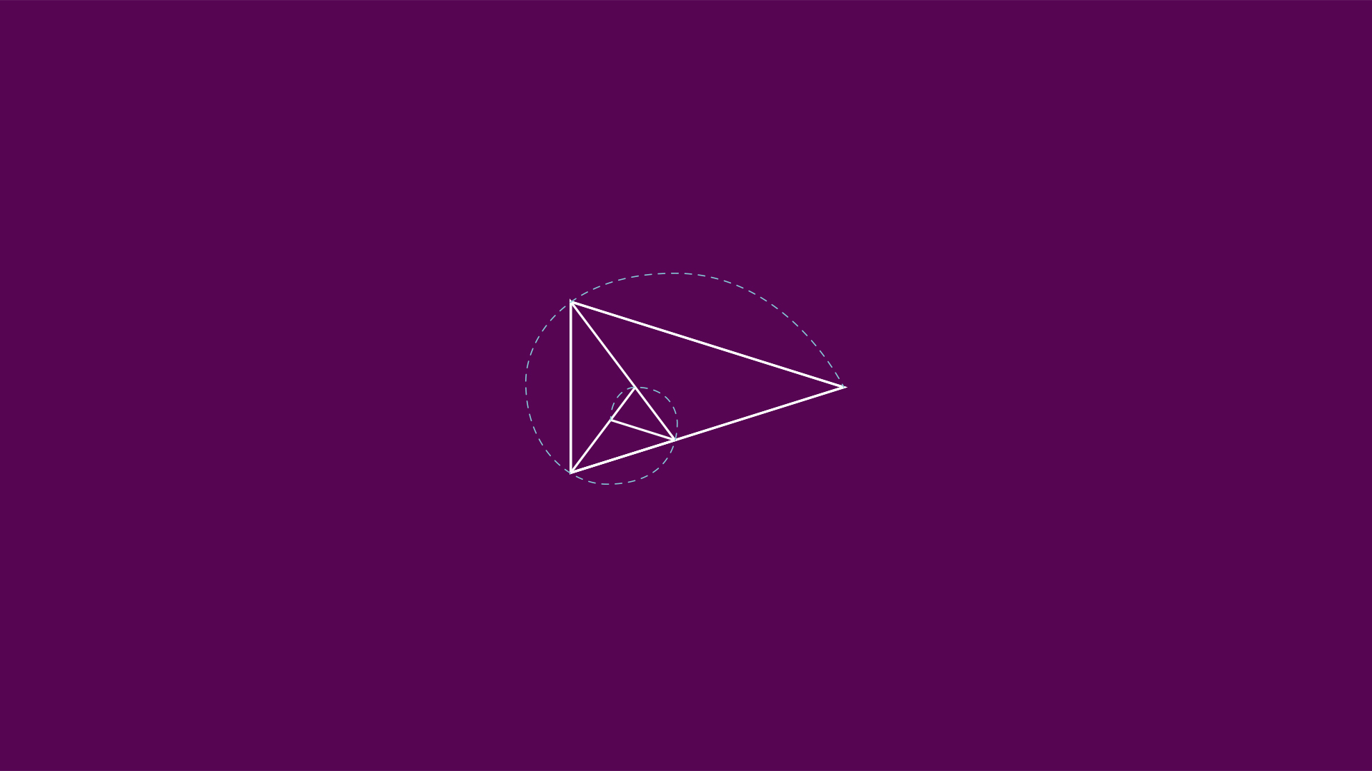
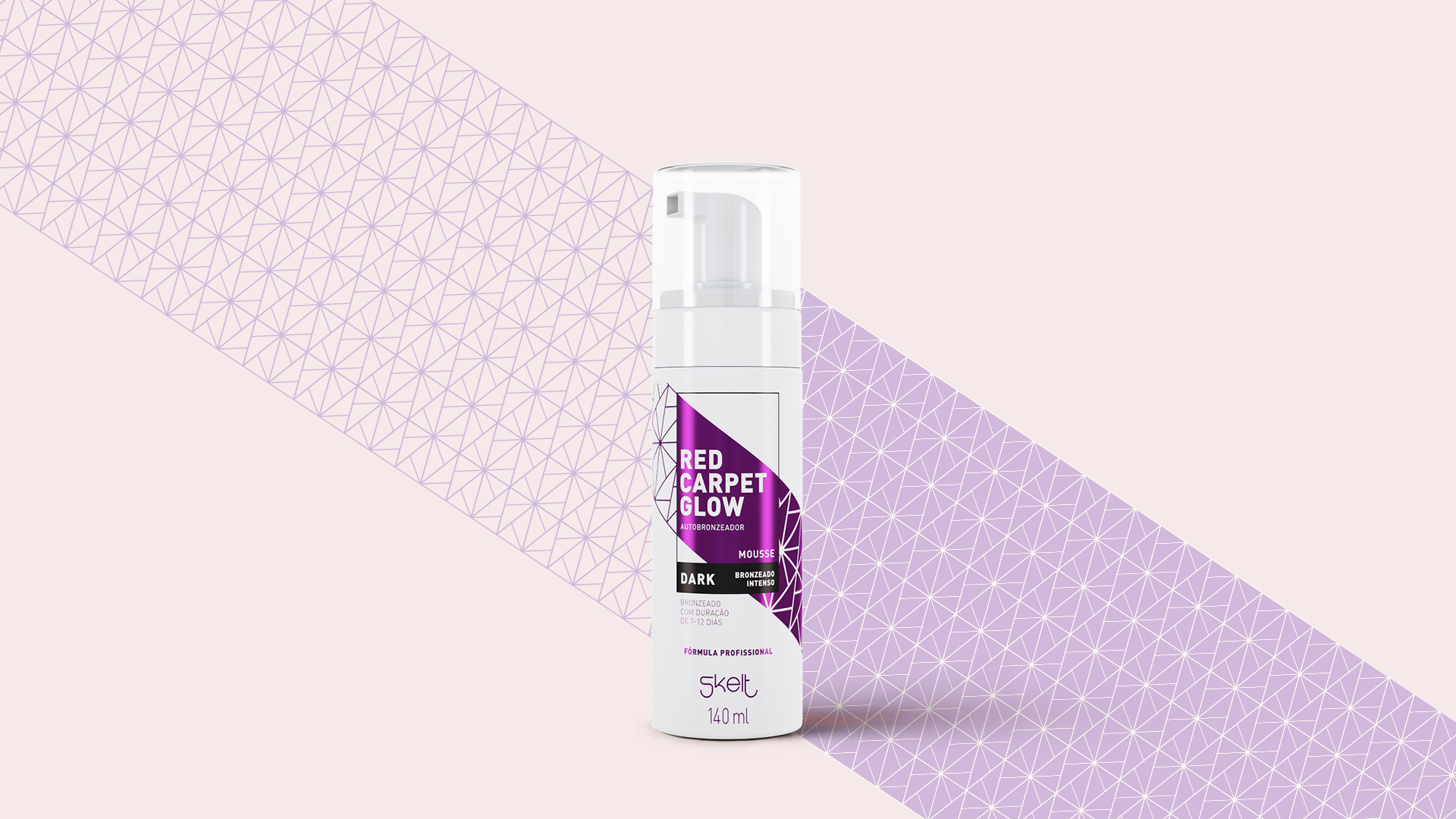
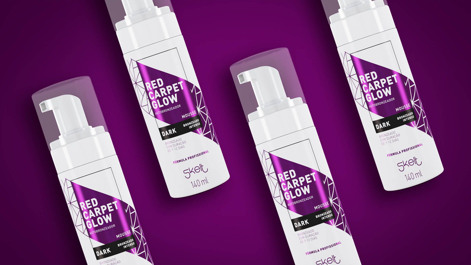

From this idea, we started to create the identity. In the patterning, we adopt the golden triangle figure. The symbol, in addition to being widely used in the area of plastic surgery to convey the idea of harmonic proportions, was applied on the packaging referring to the rays of the sun.
To convey the sensation of intensity and impact, we use the colors violet and black, always preserving the breath of the layout with the white background.
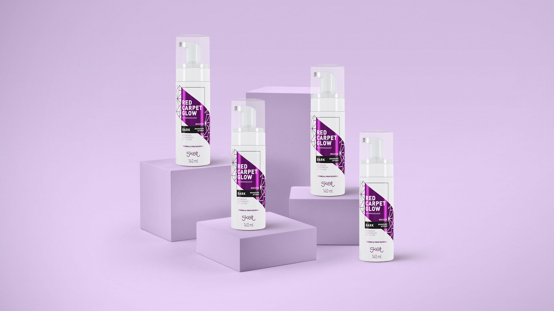
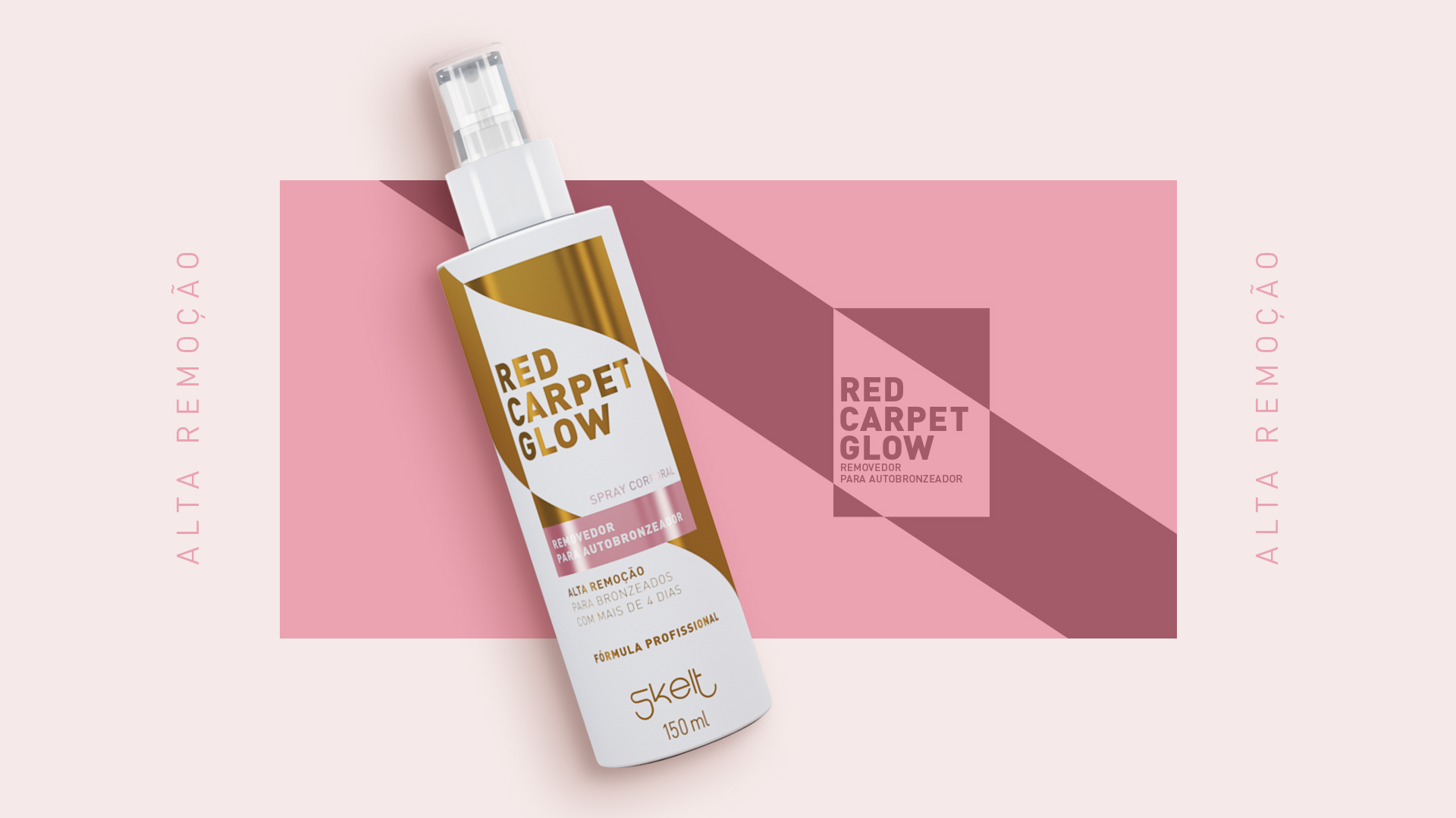
The information, organized in order of importance to the public, composes the layout in a clean, elegant and impactful way.
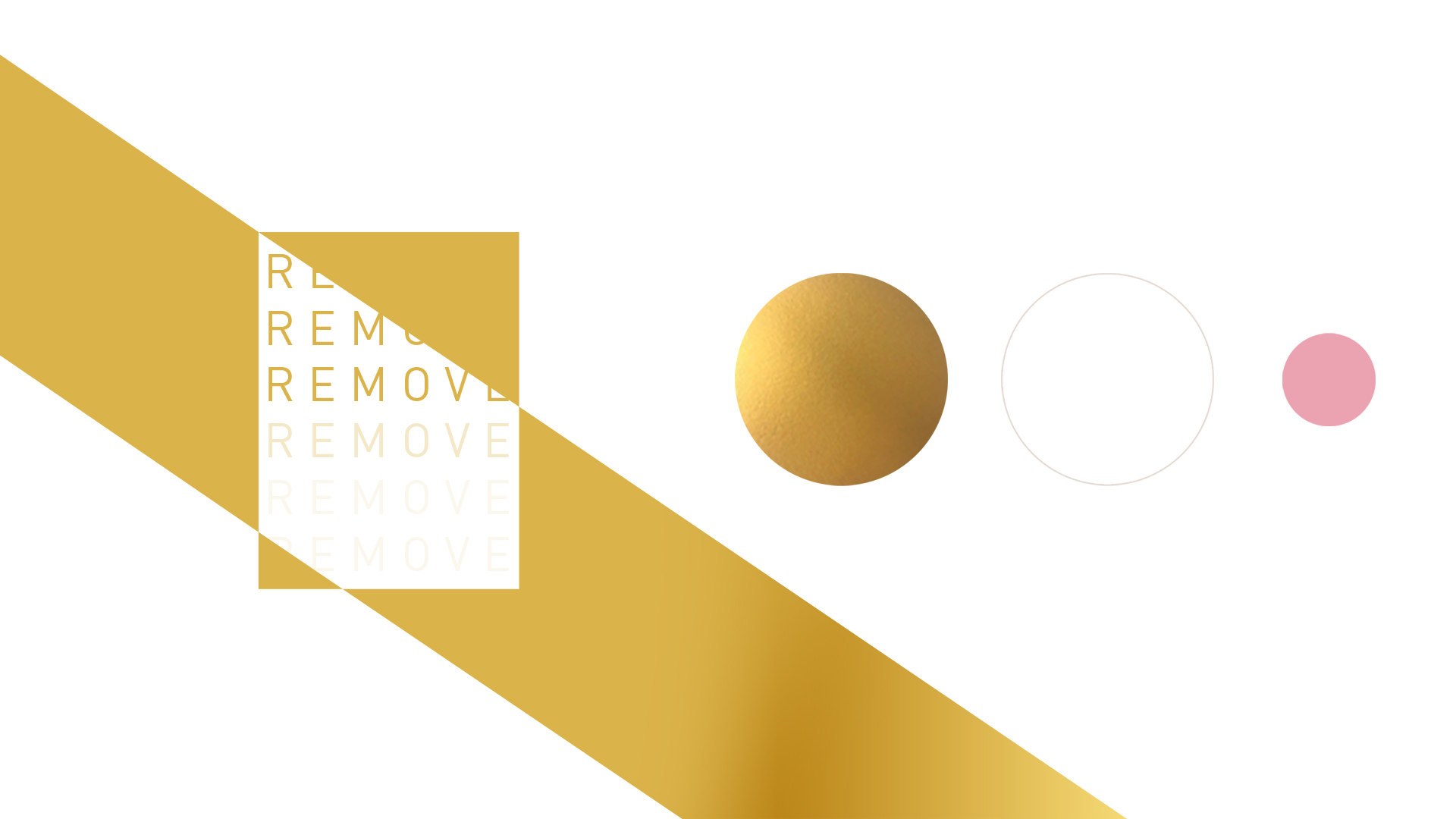
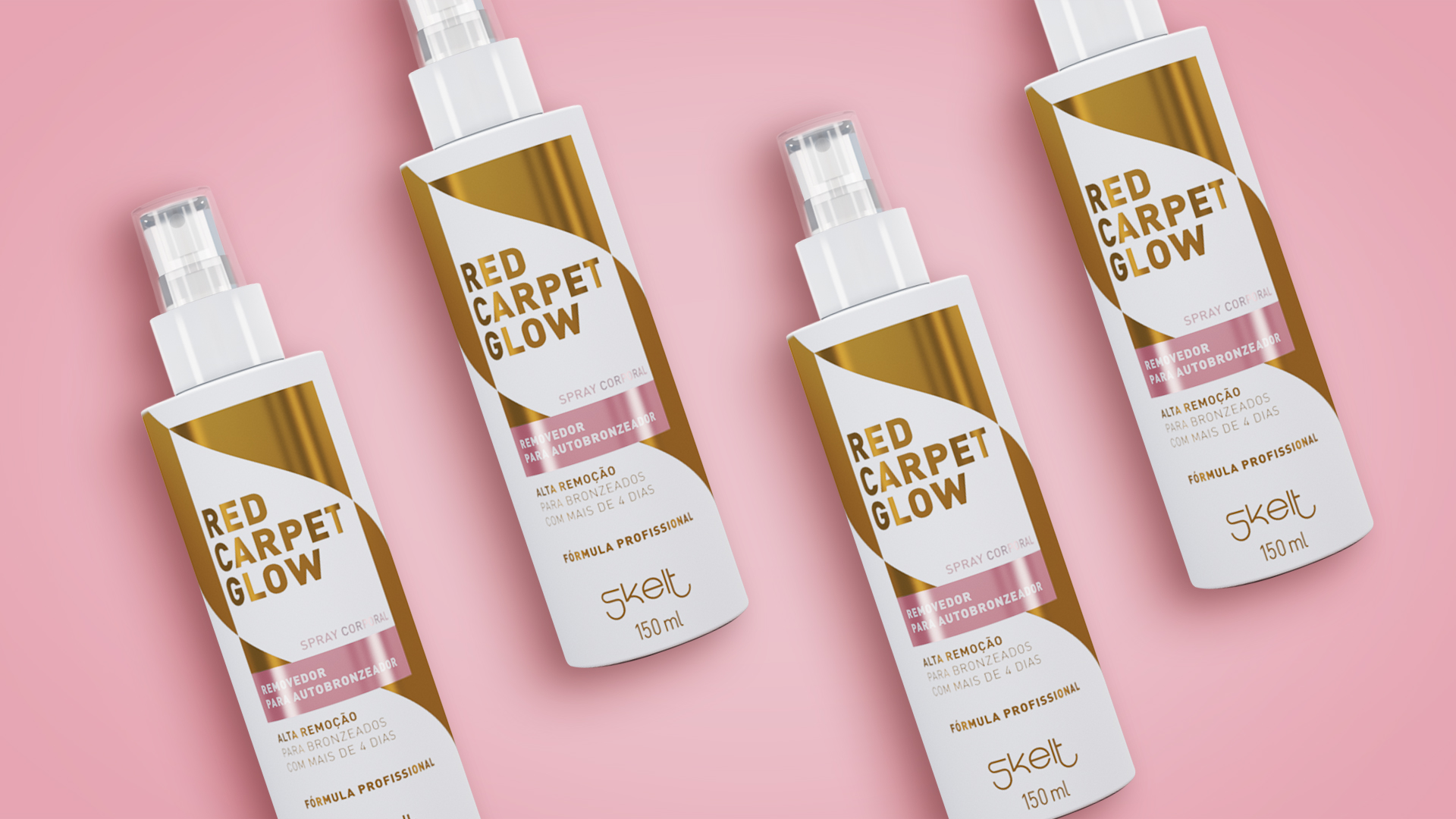
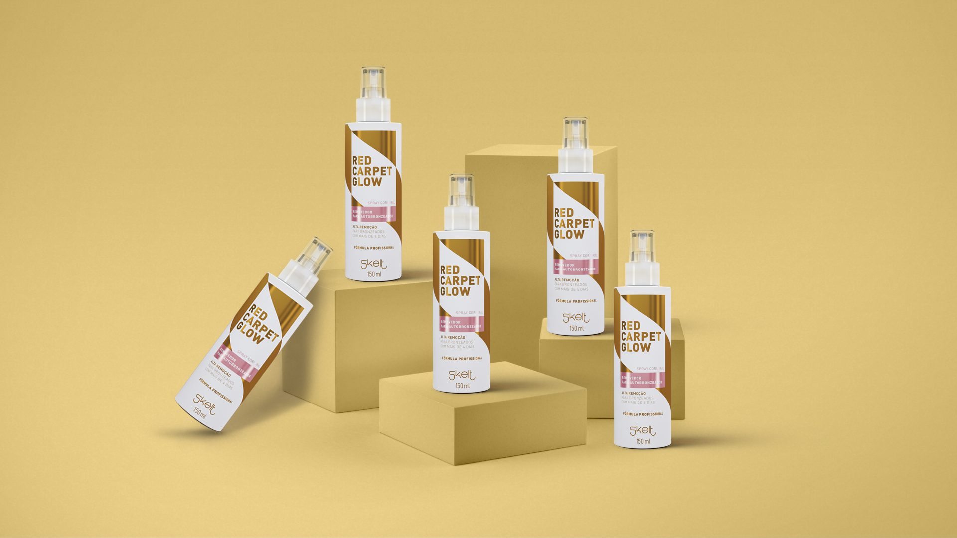
How to differentiate the remover from the self-tanner without confusing the public? Simple: inverting the colors to create an intuitive association with the idea of cleanliness.
The light pink color was chosen to break the weight of gold and transmit sensitivity, delicacy and purity, like the petals of a rose.
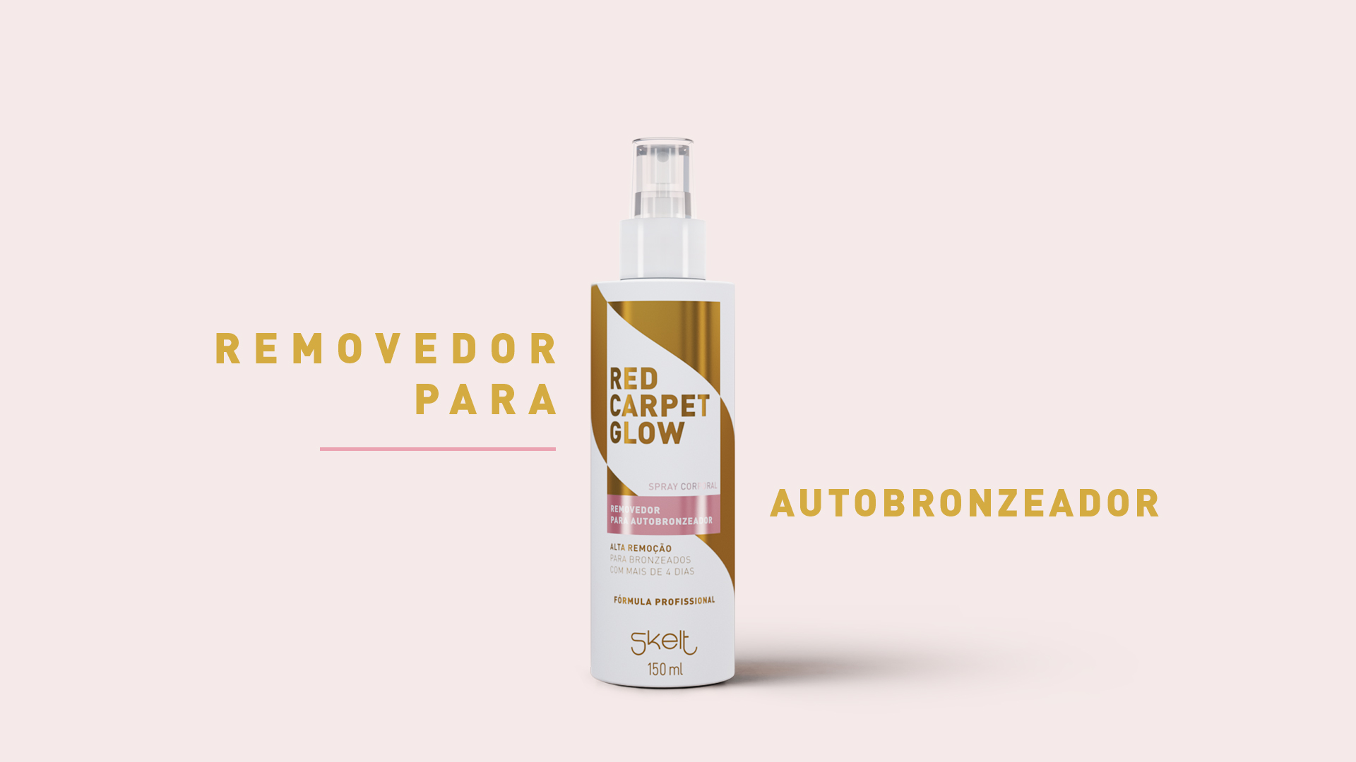
The main information of the product also gained prominence, transmitting comfort in reading and security for the customer.
In addition, we made a strip without a pattern so that the packaging is not assimilated to any specific product of the brand, but rather, is understood as the union between all the patterns of the other products.
+55 41 3039 3344 - labis@labisdesign.com