
acf domain was triggered too early. This is usually an indicator for some code in the plugin or theme running too early. Translations should be loaded at the init action or later. Please see Debugging in WordPress for more information. (This message was added in version 6.7.0.) in /home1/labis658/public_html/wp-includes/functions.php on line 6170


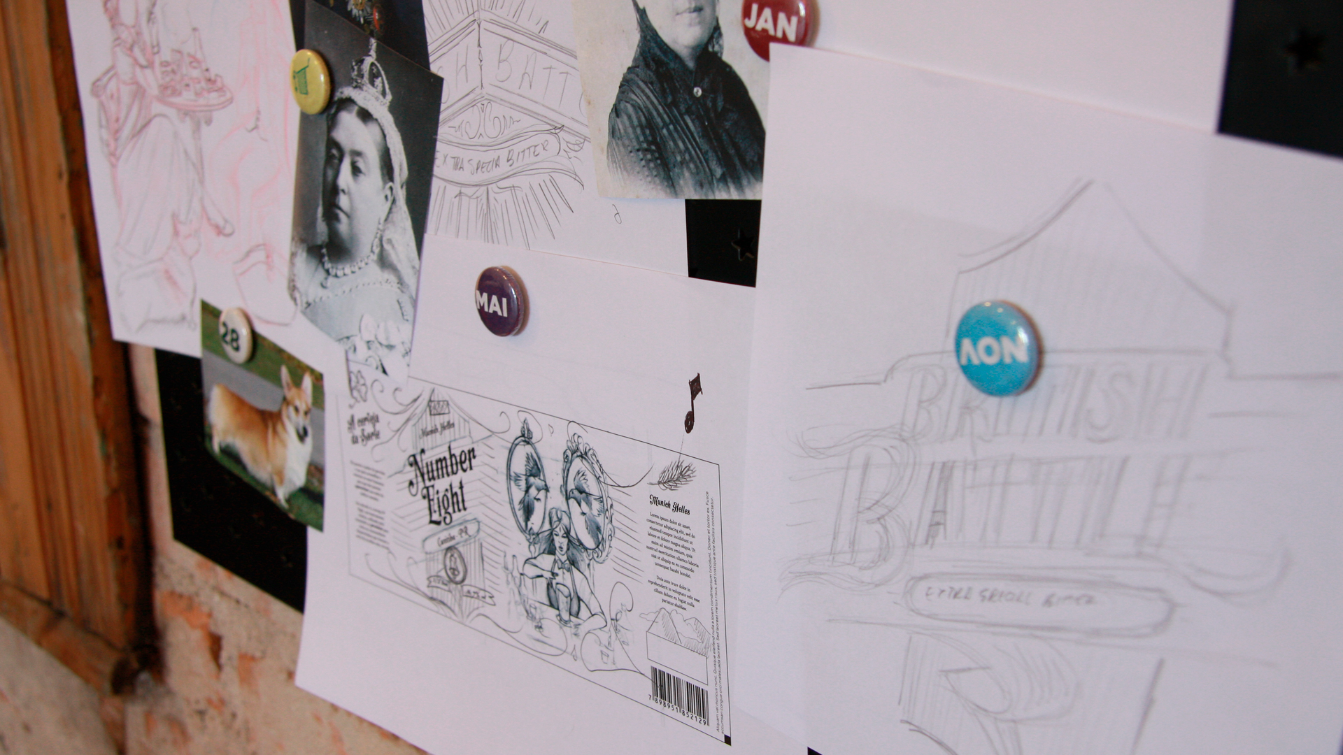
Labis Design has developed a PFAU project based on Brand Language Design, a method that has helped us to create visual identity, verbal and graphic language, as well as give us the basis to study and apply the typography, colors and illustrations ideal for Labels of the brand’s new beers.
HAUSBIER is a franchise of micro breweries in the north of Brazil, which besides producing its own beverages, provides equipment, technical advice and recipes for the 12 franchisees spread throughout Brazil, among them PFAU, which since its foundation has been aimed at being independent and Have a brand of their own to obtain greater autonomy in the development of new blends and to tread their way in the field of craft beers. In addition, PFAU has an PUB where it markets its creations.
The project was aimed at creating the new labels for beers, which were still developed under the Hausbier brand, and since there was already a plan to found an autonomous brand, Labis Design had the challenge of creating a way for the labels to be used both with The Hausbier brand as Pfau.
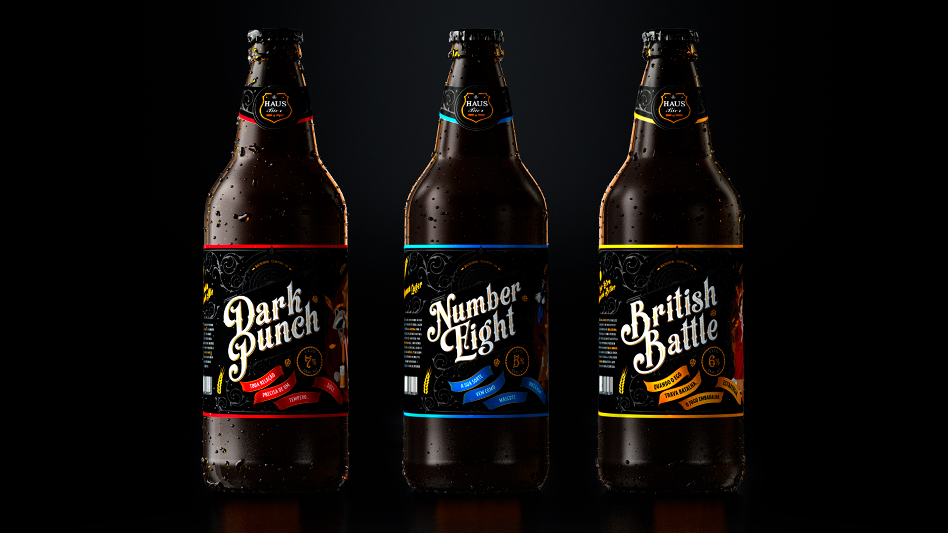
The new line of labels was created following the model adopted by the Badger brand, that is, a common frame for all bottles and each type of beer worked from the center of the label.
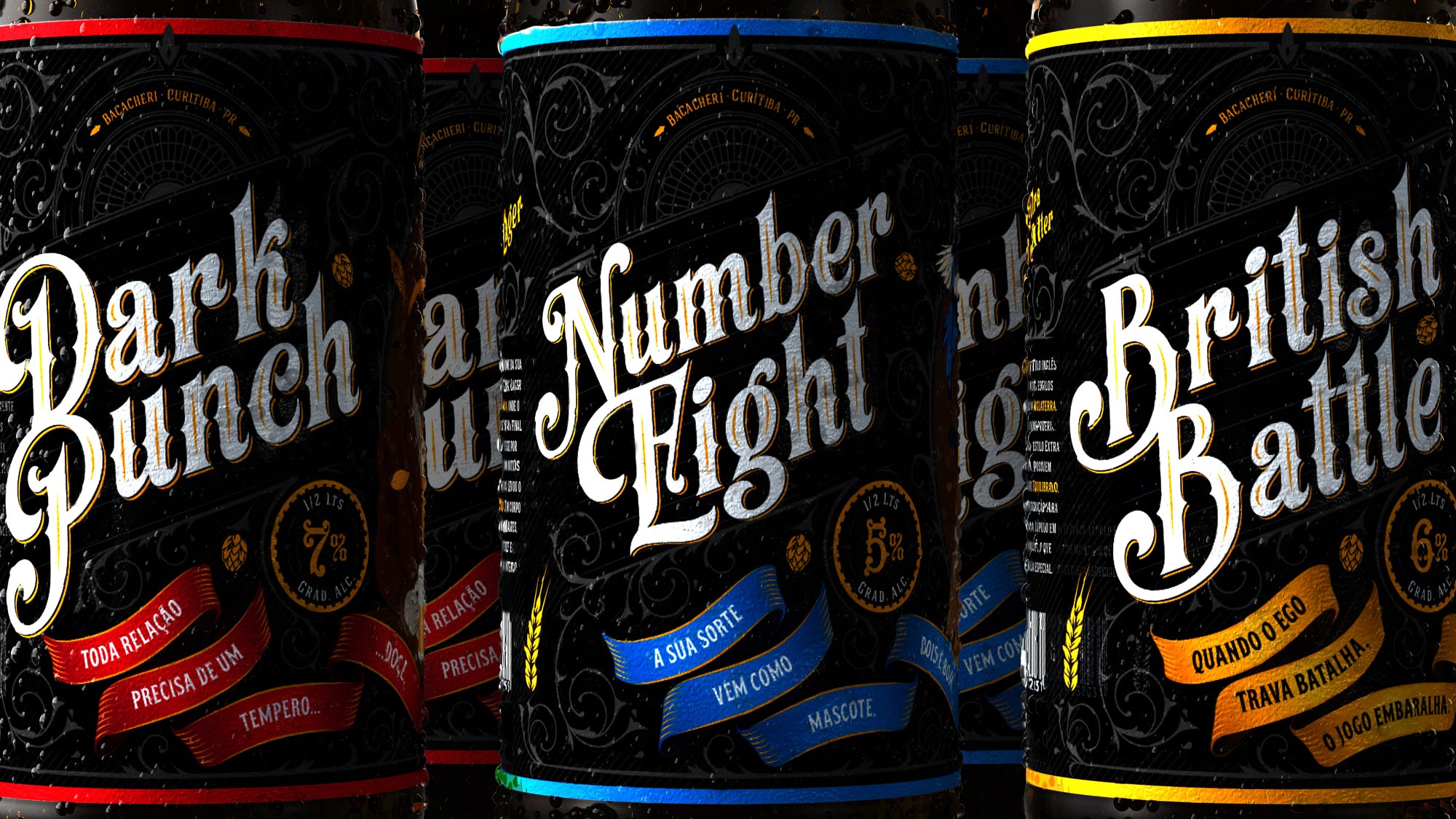
Labis Design has created the label of Pfau’s new beers with its own recipes. They are:
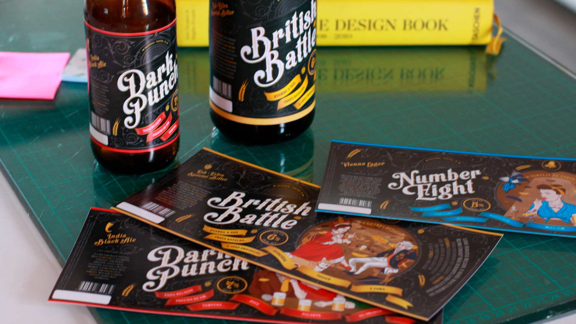
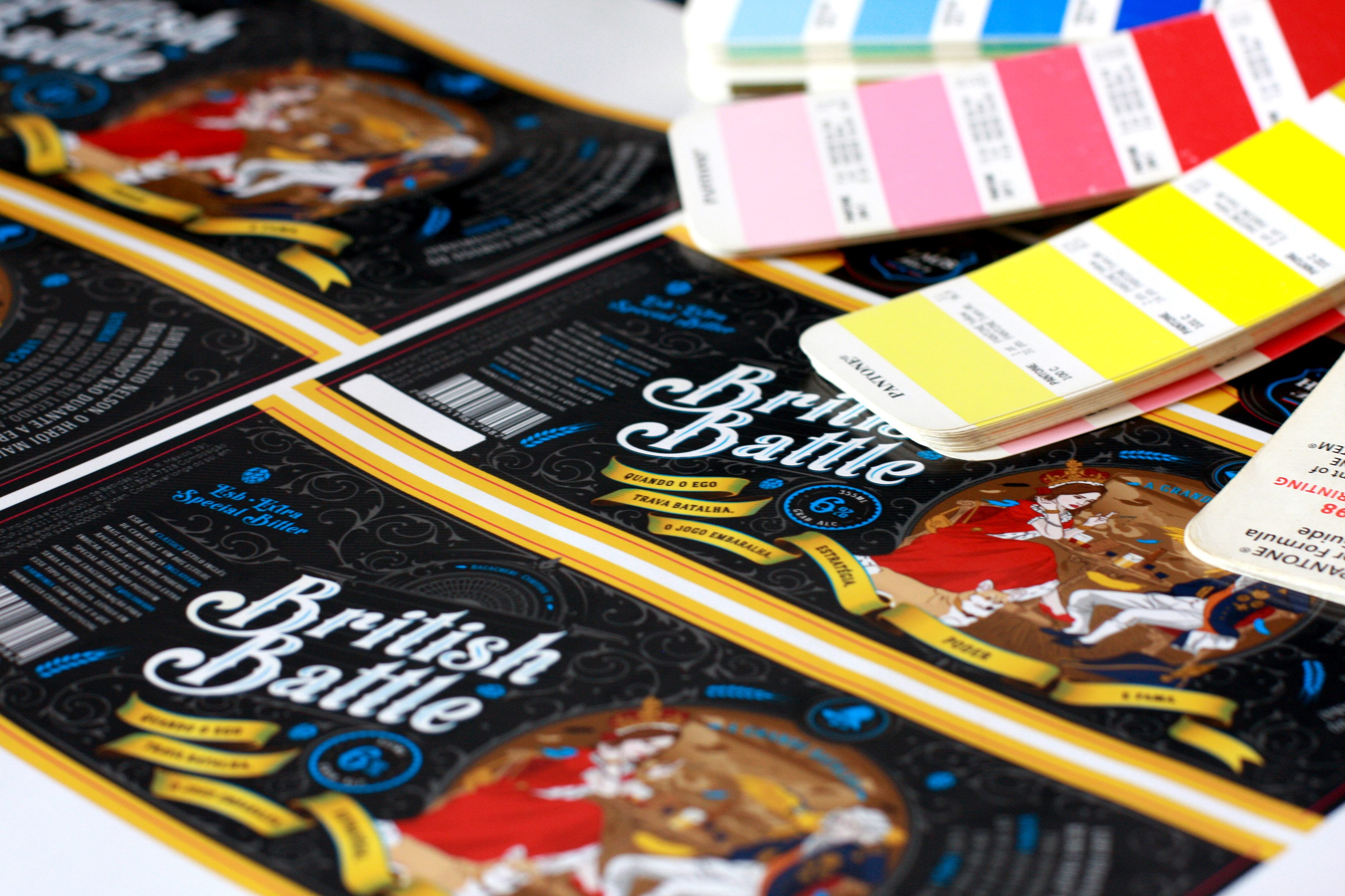
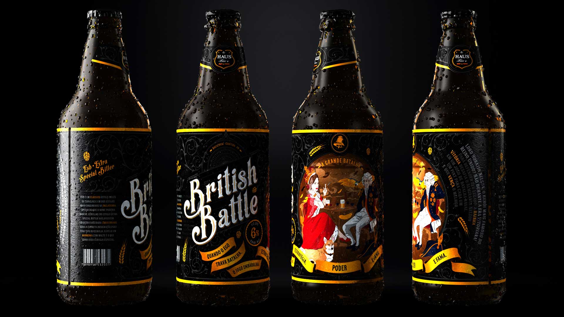
–British Batle, an ESB (Extra Special Bitter) beer;
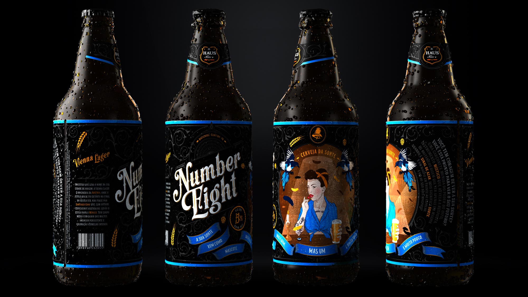
– Number Eight, type Munich Helles;
– Dark Punch IPA, an English IPA.
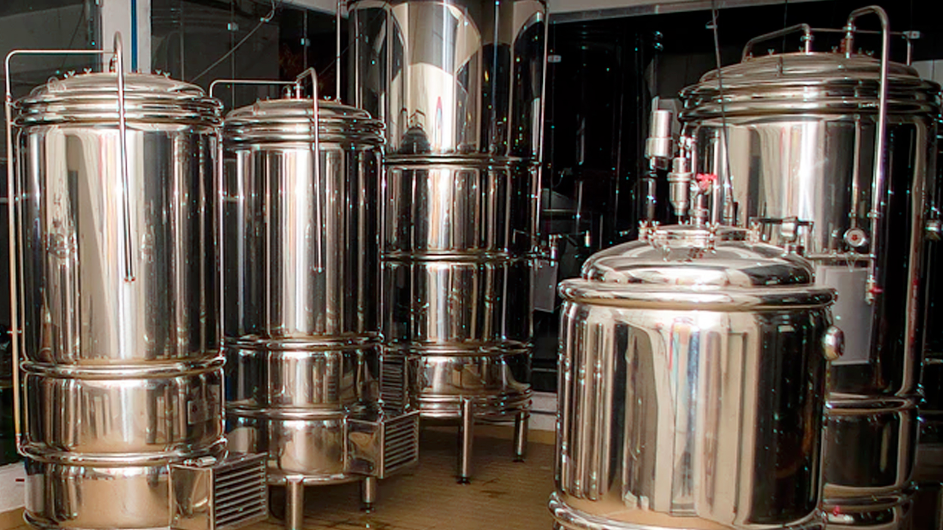
Micro Brewery is a concept of production of craft beers that has gained much prominence in recent years here in Brazil. This type of production rescues the tradition of brewing beer from the ancient monasteries of Europe and has brought Brazilians the option of consuming exclusive drinks with various types, textures, aromas and flavors.
This means that this new concept is establishing a market for gourmet beers, where drinkers have high quality products at their disposal. Small-scale production and limited distribution brings to the brand the following values: sophistication, craftsmanship, exclusivity and English brewing culture.
As we work with beers in great majority with British styles, we propose to extend this characteristic also to the verbal language, that is to say, we adopt a tone of communication that refers to the British humor that has characteristics like: nonsense, puns, black humor, eccentricity, satire , sarcasm and irony, which sometimes makes the joke go unnoticed by the public.
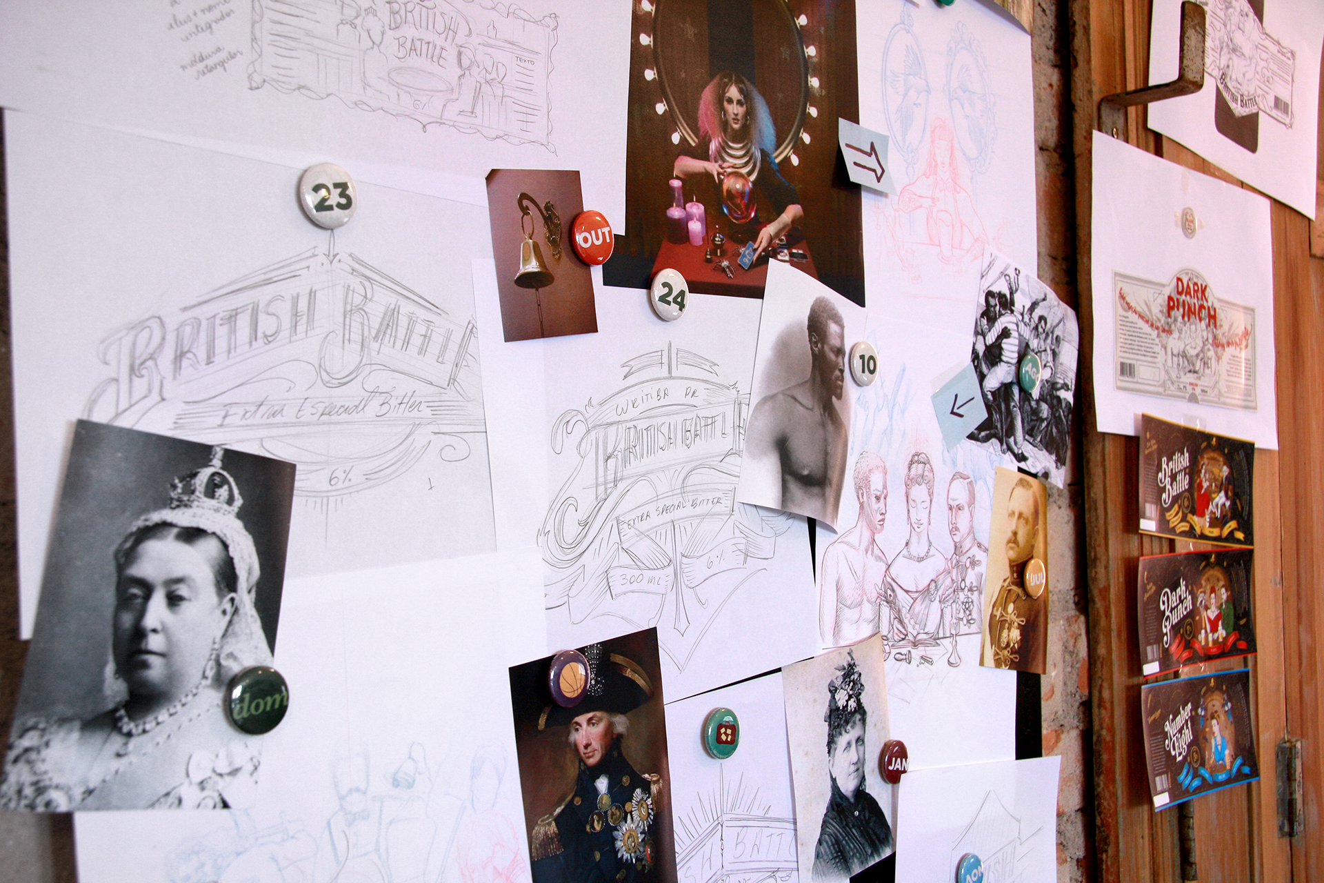
Already for the graphic language, we use as inspiration illustrations with old references, made with lithography and xylography, being worked predominant colors for each one of the beers.
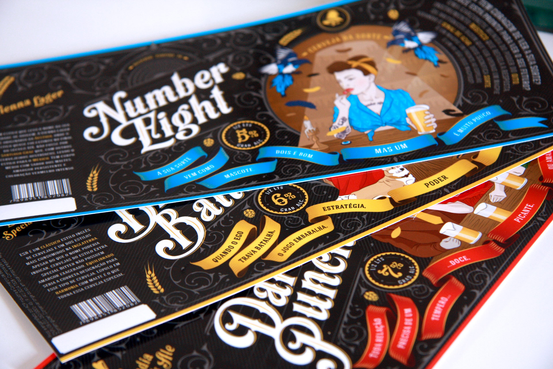
In this part of the project, the goal of Labis Design was to create a combination of typography, calligraphy and illustration generating an exclusive feature. For the name of the beers and main information we use manual calligraphy and sources of Roman humanist style, where the lettering originates from the inclined position of the pen of the calligrapher, have contrast between thick and thin stems, the triangles are triangular connected to the stem by curve And combined with various ornaments. For secondary information, we use simpler, non-serif fonts.
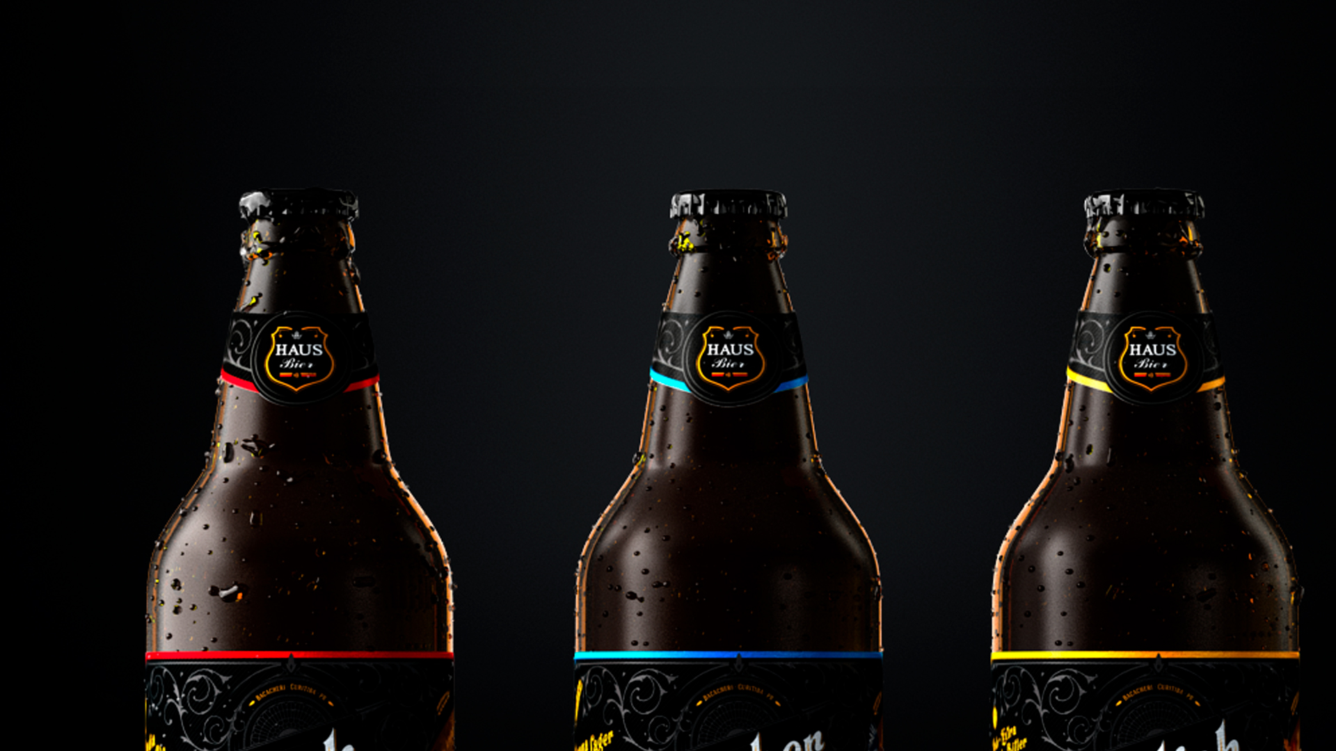
We chose to apply the Hausbier brand only on the neck of the bottle, as it would make the transition to the PFAU easier, so it is not necessary to replace all the labels, reducing costs.
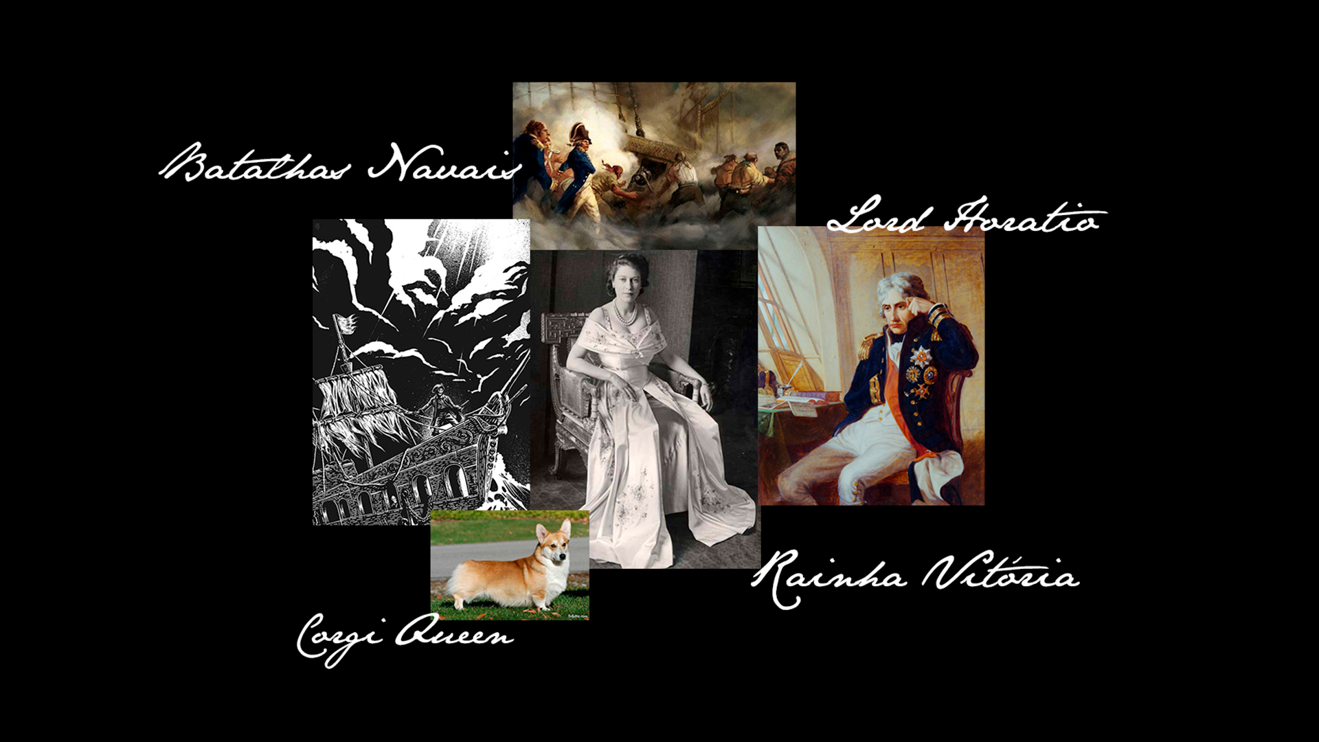
Extra Special Bitter is a classic English style of beers and one of the most consumed styles in England. In this way, the verbal language and the illustrations of this beer extol both places and icons of British history.
The protagonists of the illustration are Admiral Nelson and Queen Victoria, who were fighting a battle of egos and decide to solve it in a Battle of the English pub in an English pub. It has as complementary elements of the illustration the dog of the race Corgi, well-known to be dog of the Queen of England, besides a parrot and a glass of ESB beer.
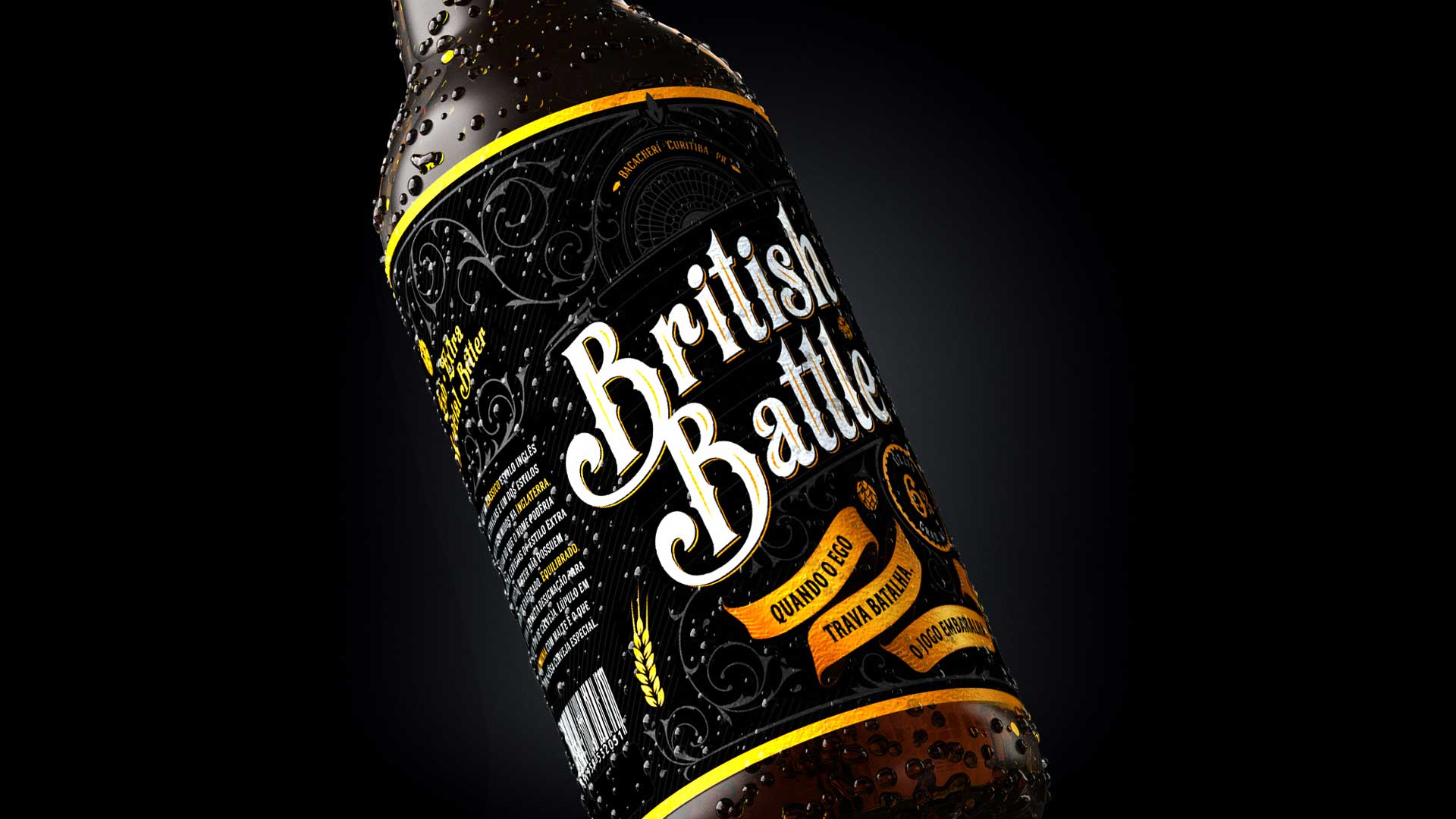
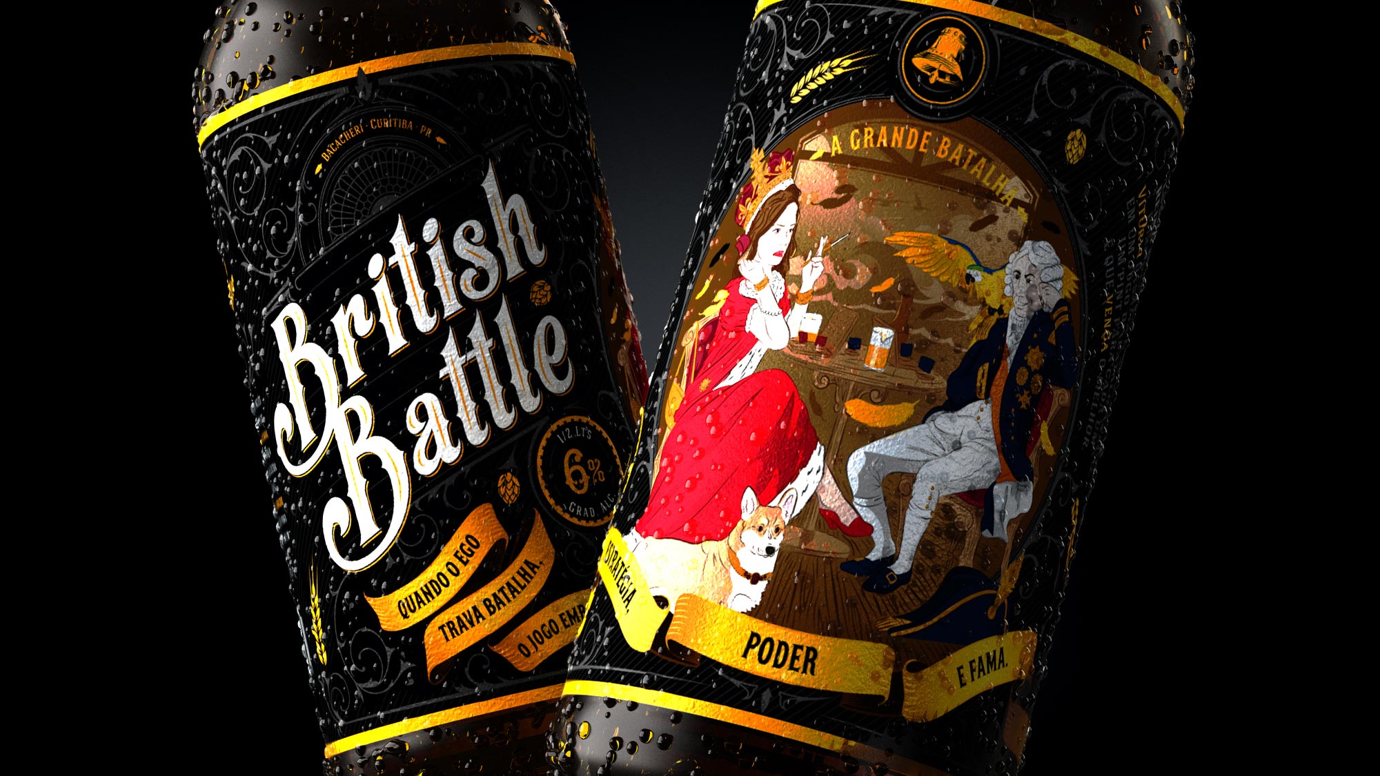
The label also has an explanatory text about beer, a text about the history that inspired the name of the beer and its illustration, a humorous phrase, as well as an icon that represents the outstanding ingredient in the drink. The predominant colors are: black, brown and gold.
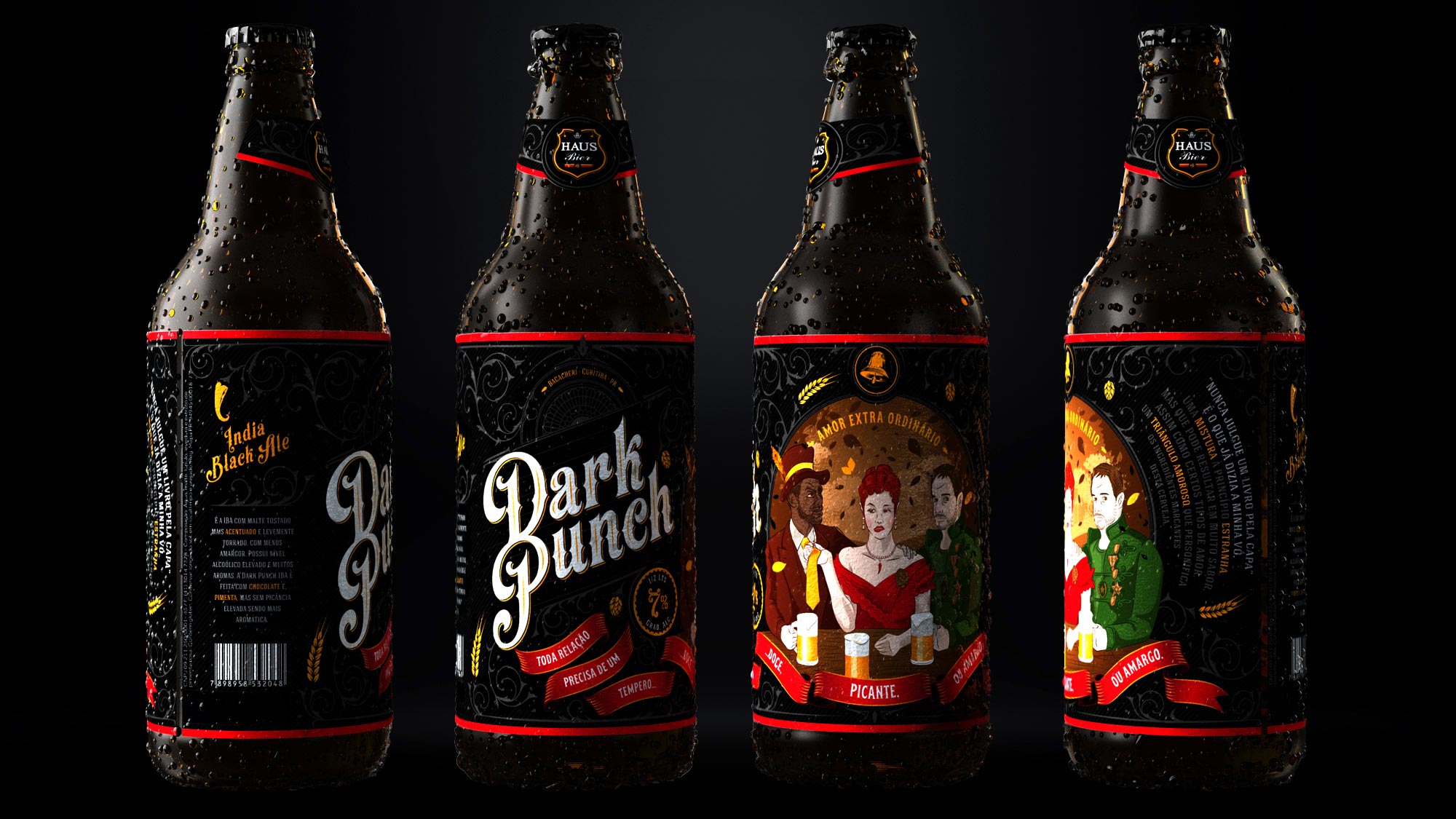
A British IPA is the least bitter of IPAs, has a more pronounced malt feature, with the most discreet hops aroma and with another aromatic profile. The Dark Pink IPA is made with chocolate and pink pepper, the latter was chosen because it is very aromatic but without spicing.
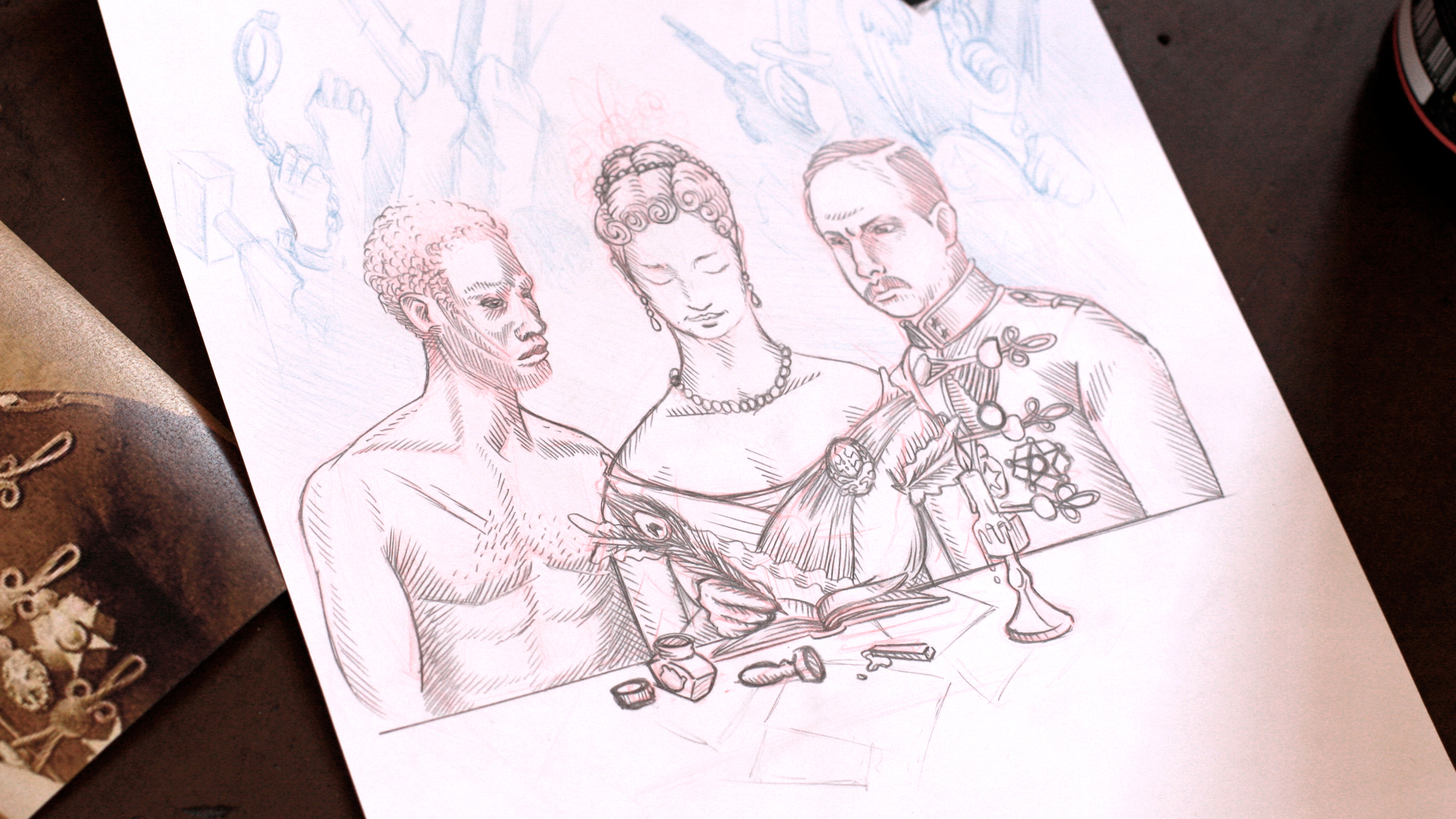
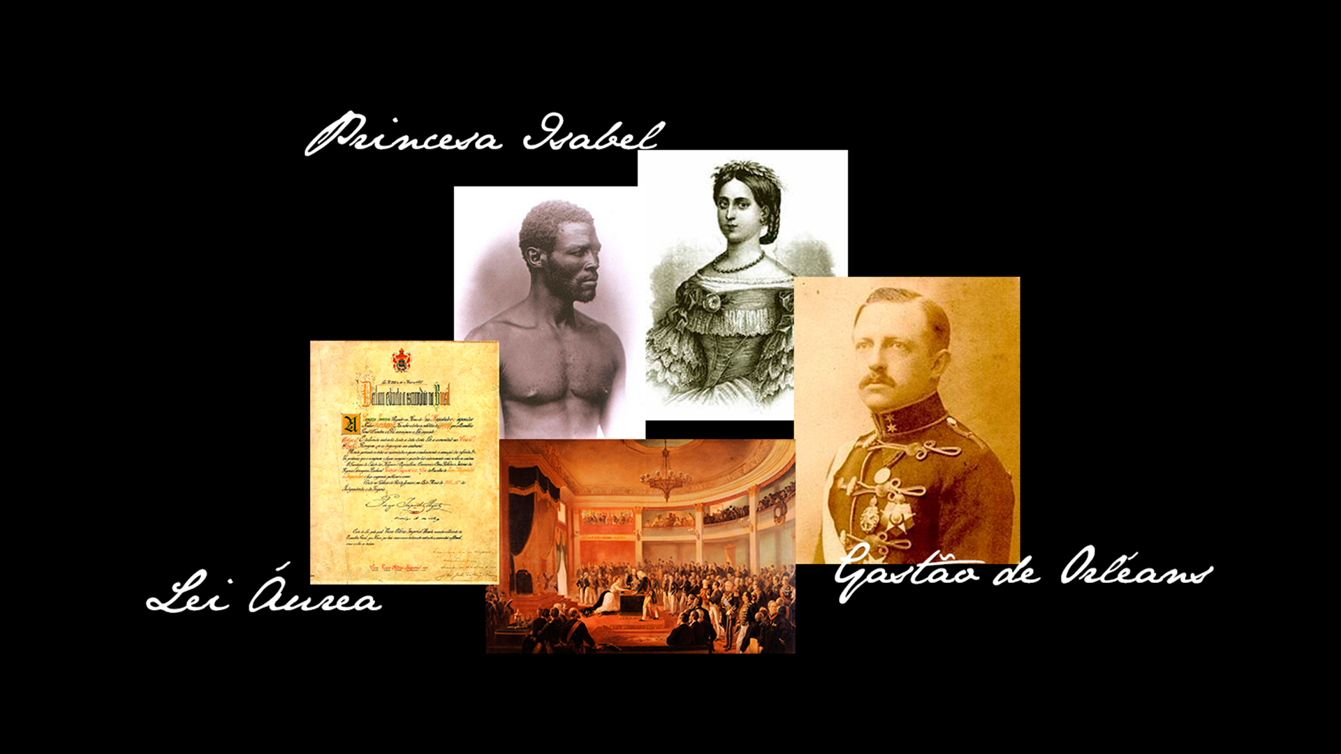
The proposal of Labis Design for this beer was to treat the ingredients as personalities: Princess Isabel (pepper – intense and with spicy flavors, associated with seduction); Gastón de Orléans (Hop – bitter flavor); Unknown slave (Chocolate – a strong and hot drink). The illustration of the label has as motto the princess Isabel, married with Gastón, however, having an affair with a slave. The label illustrates Princess Isabel signing the Golden Law to free her beloved, however, in a great conflict of ideological and loving interests.
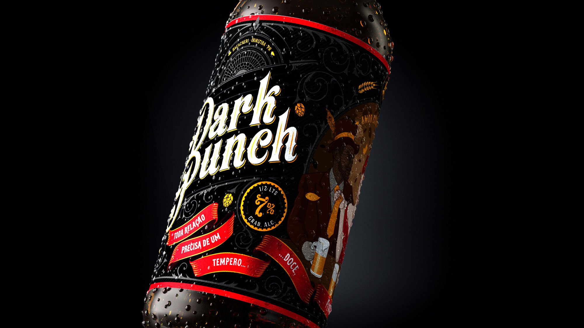
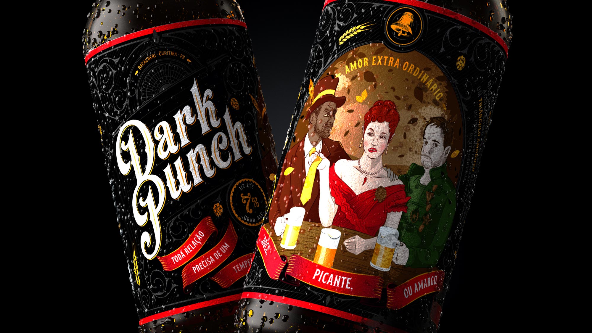
In addition, the label has an explanatory text about beer, a text about the story told, a phrase highlighting the history and the drink, an icon that represents the outstanding ingredients of the drink and historical elements of the time. The predominant colors are: black, red, gold, brown and green.
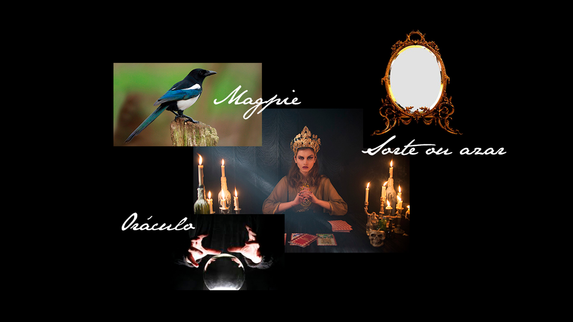
Munich Helles is a traditional beer style from Munich, Germany. With flavors of predominant pilsen cereal and malt, it has a low bitterness. It has this enigmatic name, because in several cultures the number eight means luck, perfection, fortune, achievement, that is, nothing better to define this beer than this number. “Lucky beer” is the oracle of a mysterious but powerful figure portrayed by a waitress who has the power of foresight and uses it to advise and guide human beings so they can enjoy their evening in the best possible way. The Number Eight is used to convey the predictions to those who have been lucky enough to choose this beer, it is like an amulet.
The waitress is accompanied by her MagPie mascot, which according to an English superstition, the number of magpies you see determines luck or chance. Because it is accompanied by a mascot only, it is determined to be unlucky, but the species of the animal is one of the only ones that can see its reflection, therefore, as it is reflected in a mirror on the other side of the room, one sees two magpies and luck Is determined.
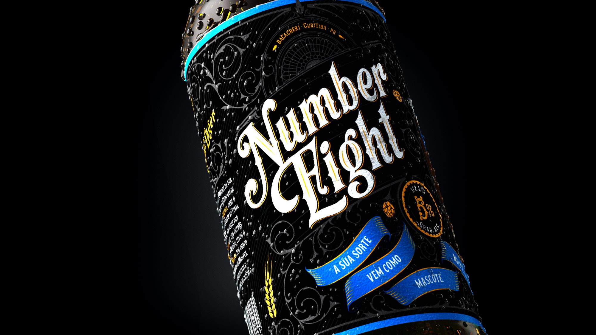
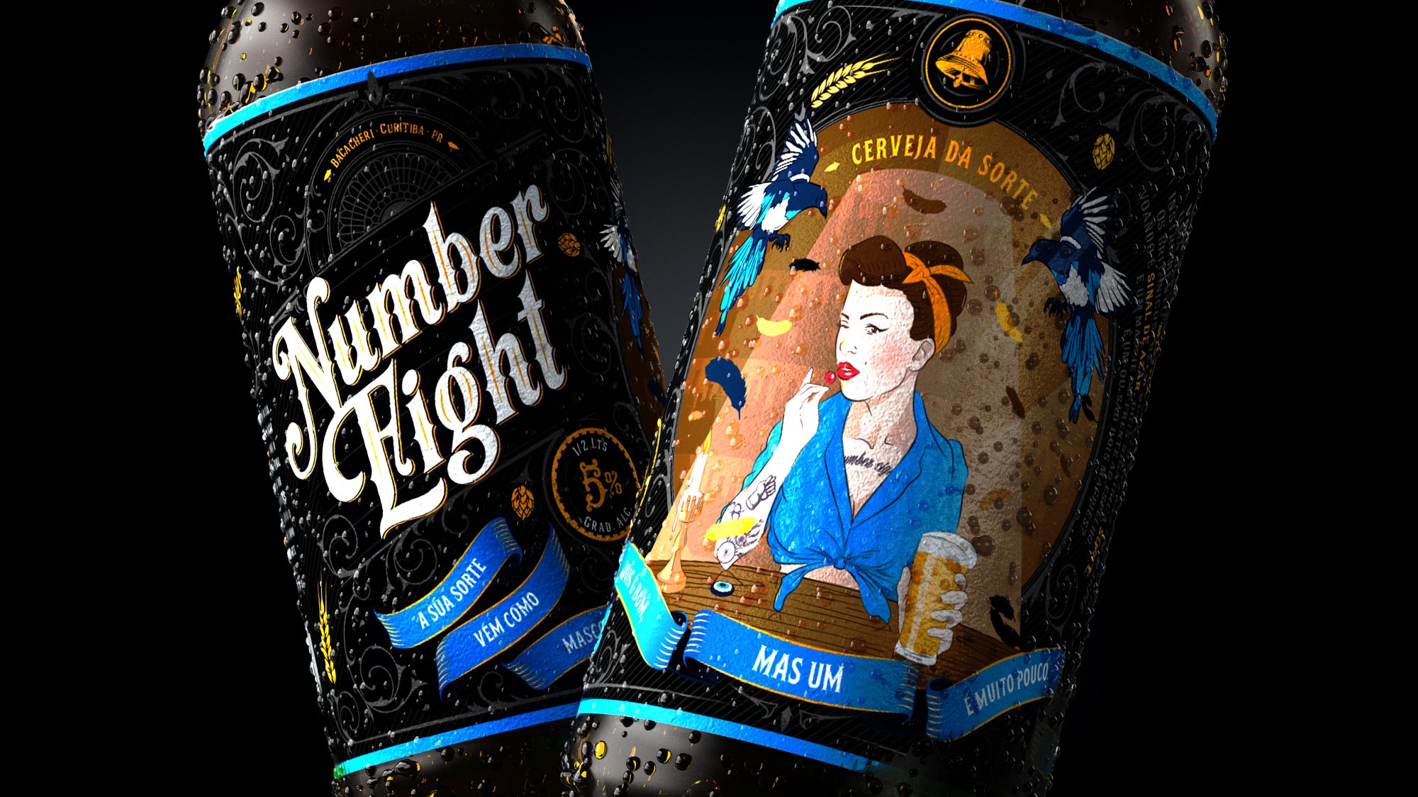
In addition, there is a text explaining beer, another text explaining the name and its history, an icon that represents a remarkable ingredient of the drink and a humorous phrase referring to luck. Its predominant colors are: Black, blue, gold and brown.
+55 41 3039 3344 - labis@labisdesign.com